i made this site with sublime text and host it through github!
i bound every book you see on this site!
hi! i’m christine xia and i am currently a senior designer at concrete in toronto. this site features a selection of my extracurricular design projects and personal works.
to know more about me, you can look here and you can reach me at hi@xiaxiaxia.design.
- some of my most recent design projects:
Unchanging and changing and changing art exhibition (2023)
Congratulations, It’s a Girl short film (2023)
Florence short film (2023)
Lost in Eden short film (2023)
my main personal works are here:
Plates on Plates on Plates (2024)
Thank you for reminding me (2019)
Essentially Anonymous (2020)
Grave Eternity (2019)
Human Artifacts (2019)
Defunkt typeface (2020)
Save Us All! (2020)
A Hundred Flowers Bloom (2018)
and i also have some smaller projects and extra/fun stuff here:
大哥 (2019)
My website is a sandcastle anticipating the rising tide (2019)
Rave in Berlin 1100 (2019)
Monday Night Seminars (2019)
SATURATION III (2019)


Plates on Plates on Plates, 2024
// Handbound 6.5 × 6 in zines.
Plates on Plates on Plates is a peek into my phone folder of the same name. While mainly featuring vanity plates spotted in the wild, it also includes some standard issue plates, bumper stickers, vinyl wraps, and other car-related photos.
These roughly 250 images were collected over the span of two years and have been organized into a gridded catalog, grouped together by common themes and traits. Some of my favourite license plates are highlighted on two-page spreads that, when held open, are to-scale recreations of a standard 12 × 6 in plate.
50 pages
Cover: 81lb Quartz Stardream Paper
Spine: 81lb Silver Stardream Paper
M6-1.0 × 10 mm Nuts and Bolts
Interior: 20lb White Bond Paper
Printed by Dot Grain Ltd.

Thank you for reminding me, 2019
// 42 min 9 sec video, handbound 5 × 7 in book, interactive installation (oscilloscope, microphone, script).
// 42 min 9 sec on-location performance.
Thank you for reminding me is a multimedia performance project that creates new connections with our surrounding spaces by embracing the mistranslation of old ideas. Rather than taking a flawed approach to adapting valuable yet somewhat outdated writings and beliefs from the past, this work attempts to find beauty in the bits and pieces that are lost in translation while still acknowledging both the past and present. This project will continually iterate by pairing new texts with new locations, resulting in a growing number of documented performances/scenes that hold unique connections with their respective spaces.
The work is composed of three parts: a video documentation of the on-location performance, a book made from the logged speech-to-text of said performance, and an interactive installation of the oscilloscope and a script of the selected piece of writing.

// 183-page book of recorded speech-to-text and video stills from We have only just met (Scene 1).

// Interactive installation: the microphone and script sit on one side of the door while viewers can watch the text on the oscilloscope from the other side, out of range of the speaker’s voice.
This scene uses the introductory chapter of Lauren Elkin’s Flâneuse: Women Walk the City in Paris, New York, Tokyo, Venice, and London which reframes the idea of a flâneur from its original definition for the bourgeois French man to fit the way we move through cities today.
Using the old technology of an oscilloscope, the more contemporary tech development of Google’s Cloud Speech-to-Text, and my own flawed reading of the chapter, I set myself in the alleys hidden within Toronto for my performance. The text generated from my reading was then taken to create a 183-page book of Elkin’s original 21-page chapter.
Unchanging and changing and changing, 2023
// Exhibition and promotional designs for Alexa Hatanaka’s solo exhibition, Unchanging and changing and changing, at the Japanese Canadian Cultural Centre.
The exhibition features wearable washi artworks that are imbued with the life of the performers alongside the histories of craft and environments that inform them, namely her recent time spent with seventh generation washi makers in Japan, Kashiki Seishi.
Hatanaka reflects on personal aftershocks from tsunamis, both real and metaphorical, integrating her formative childhood experience in dance at the Japanese Canadian Cultural Centre.
Typefaces used: Buduj Sans by Tsanko Type and Degheest Director from Velvetyne.
// Wall texts installed at the entrances of the exhibition hall.
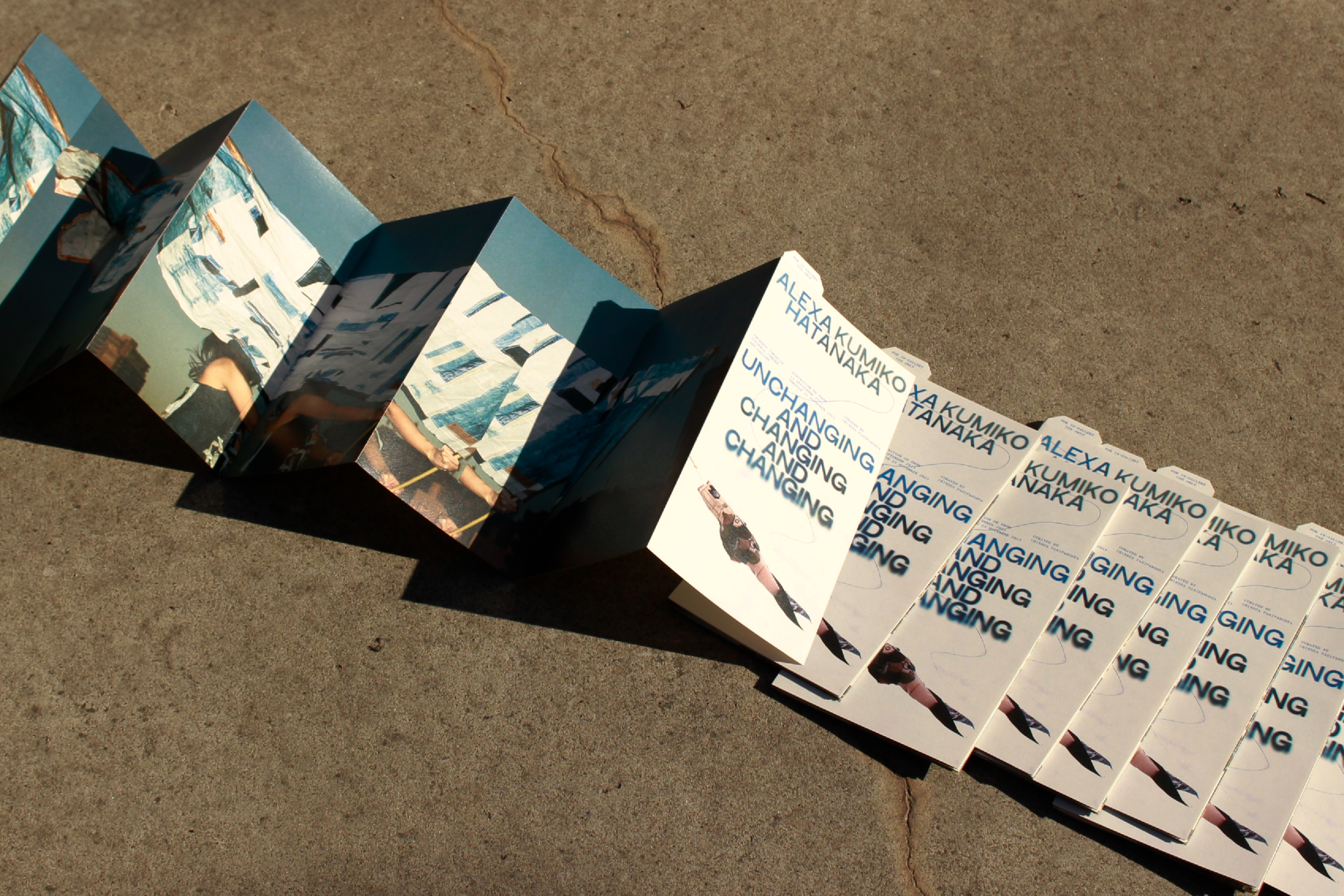
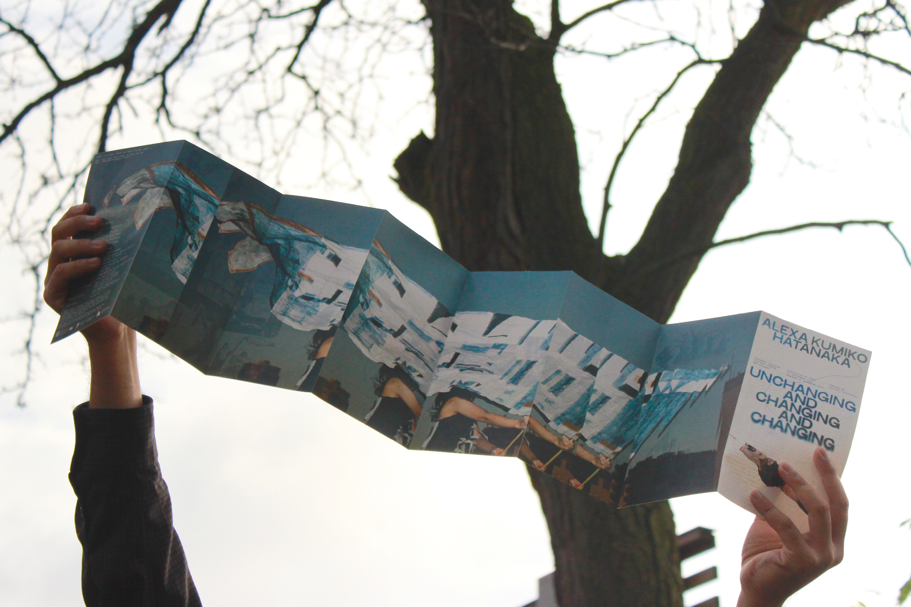
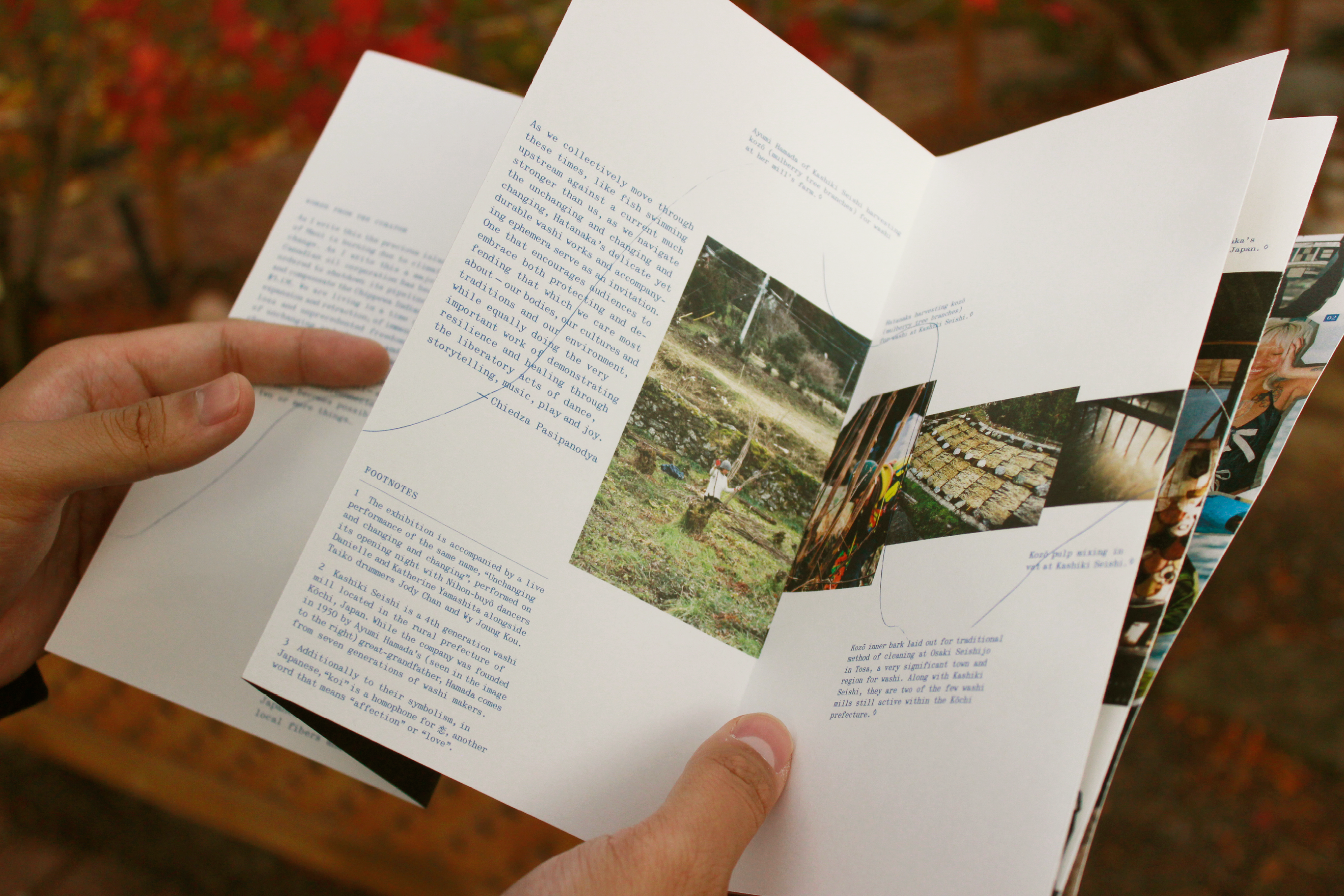
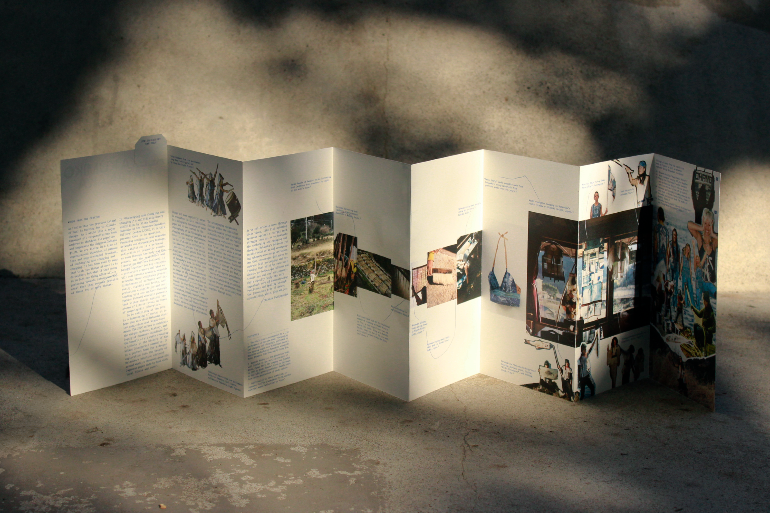
// In-gallery pamphlets featuring an essay by the curator, Chiedza Pasipanodya, and documentation of the artist’s residency at a washi mill in Japan.
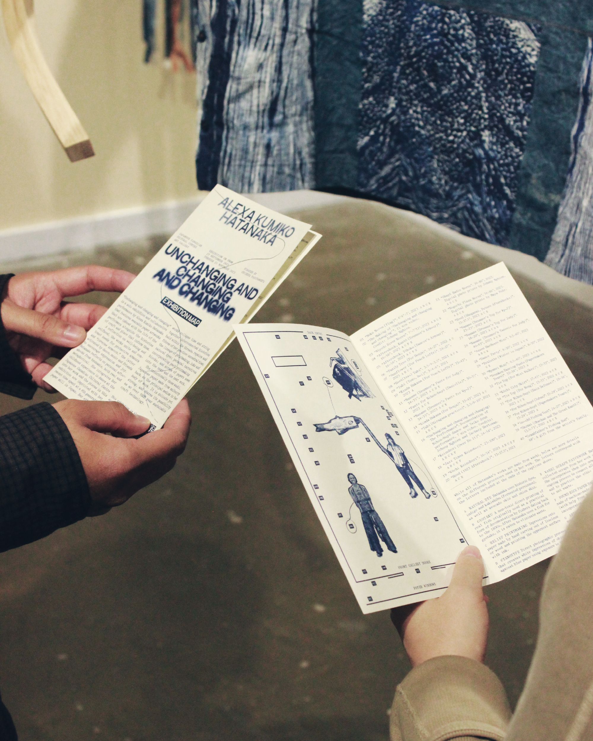
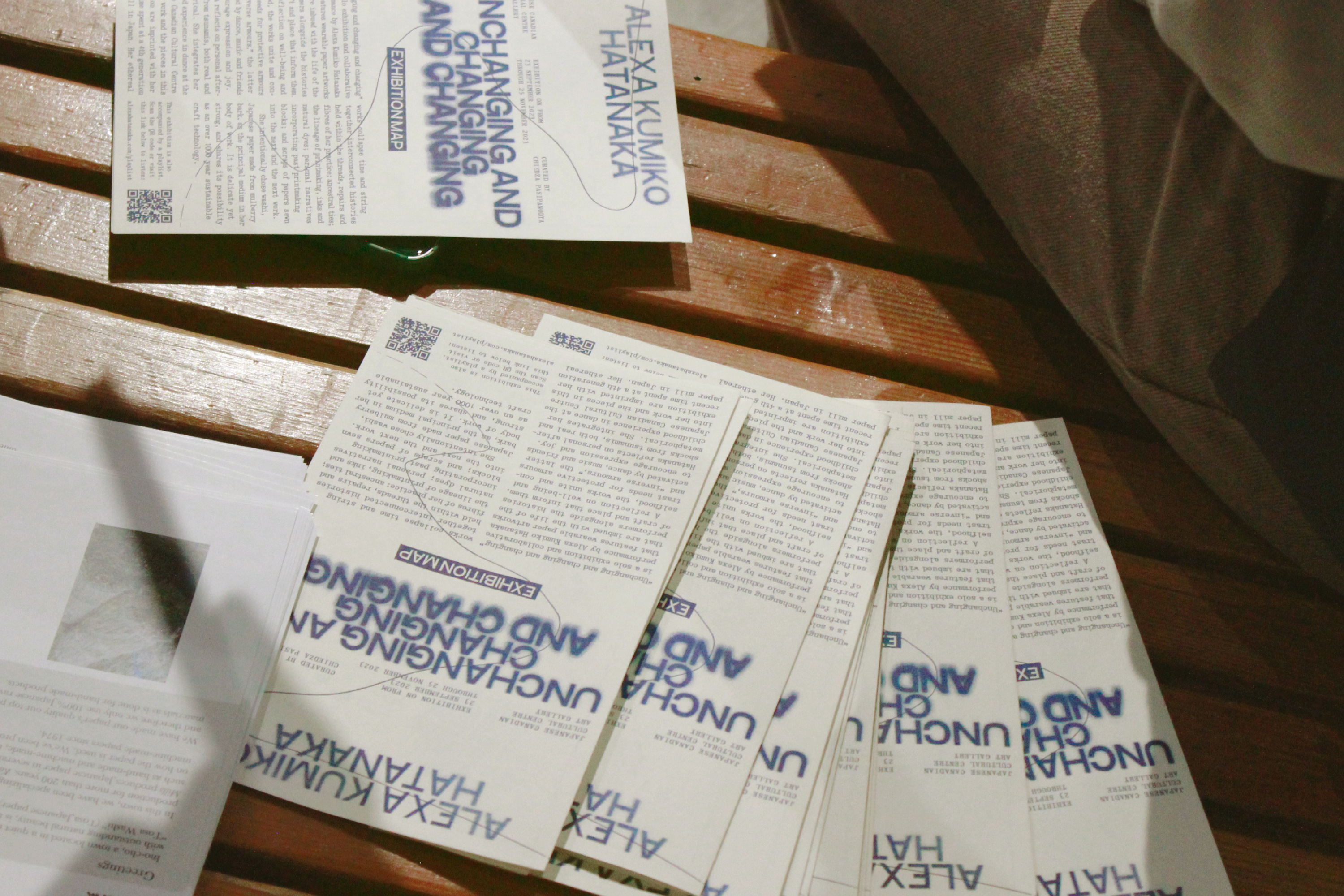
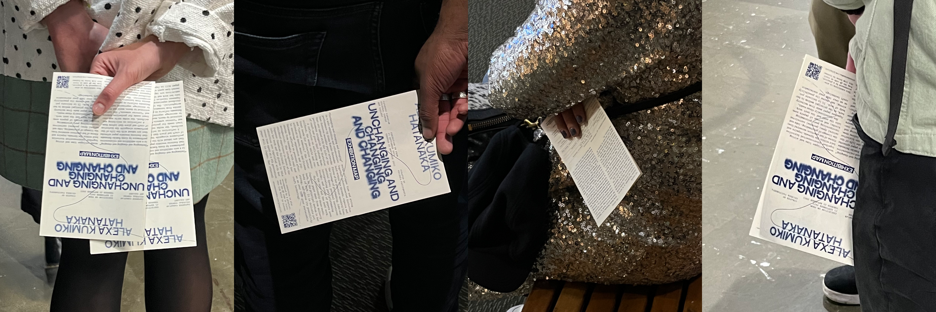
// Risograph exhibition maps.
// Promotional Instagram posts.
// Title design for a documentary by Johnny Nghiem documenting Hatanaka’s practice and residency.
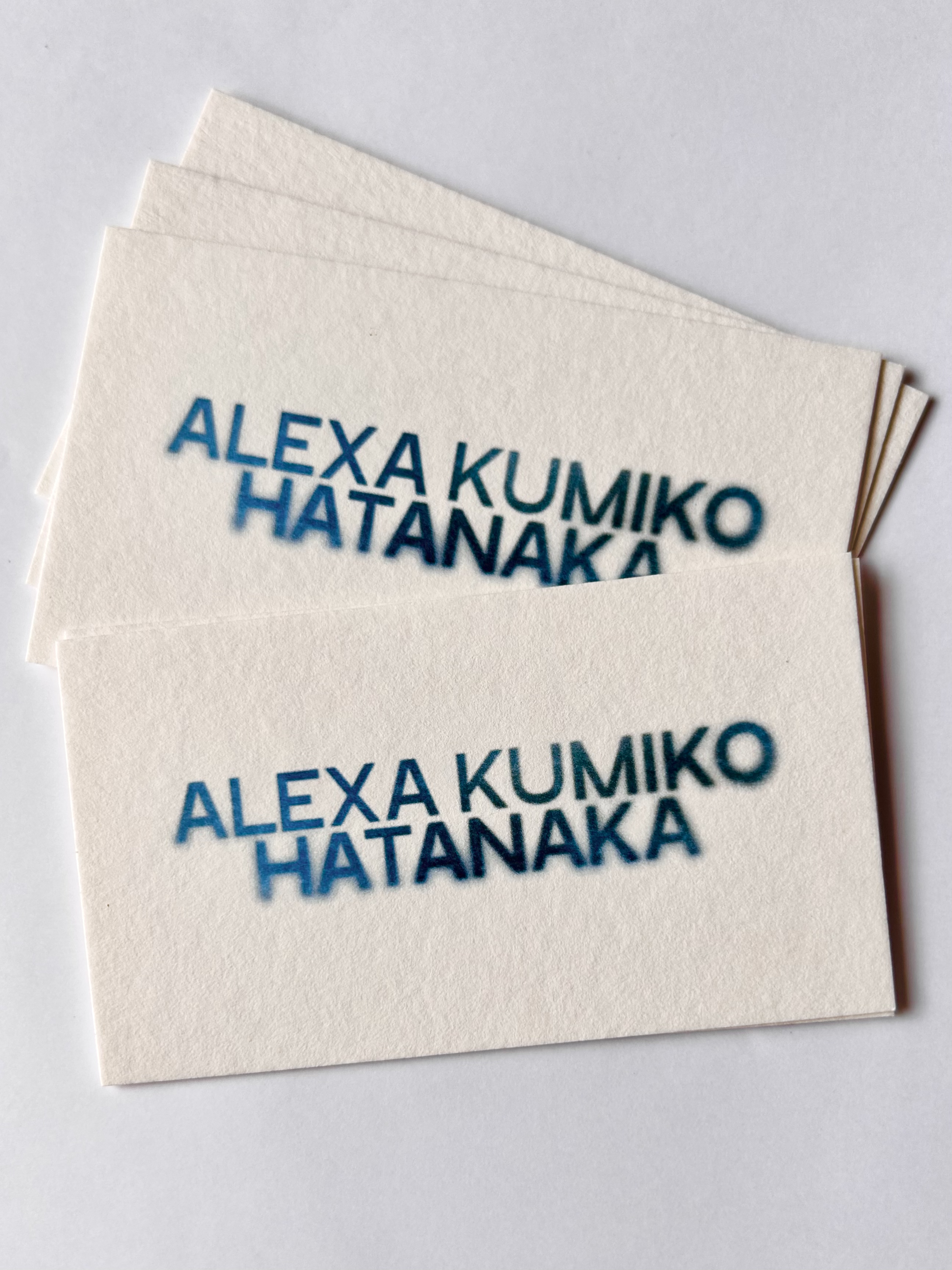
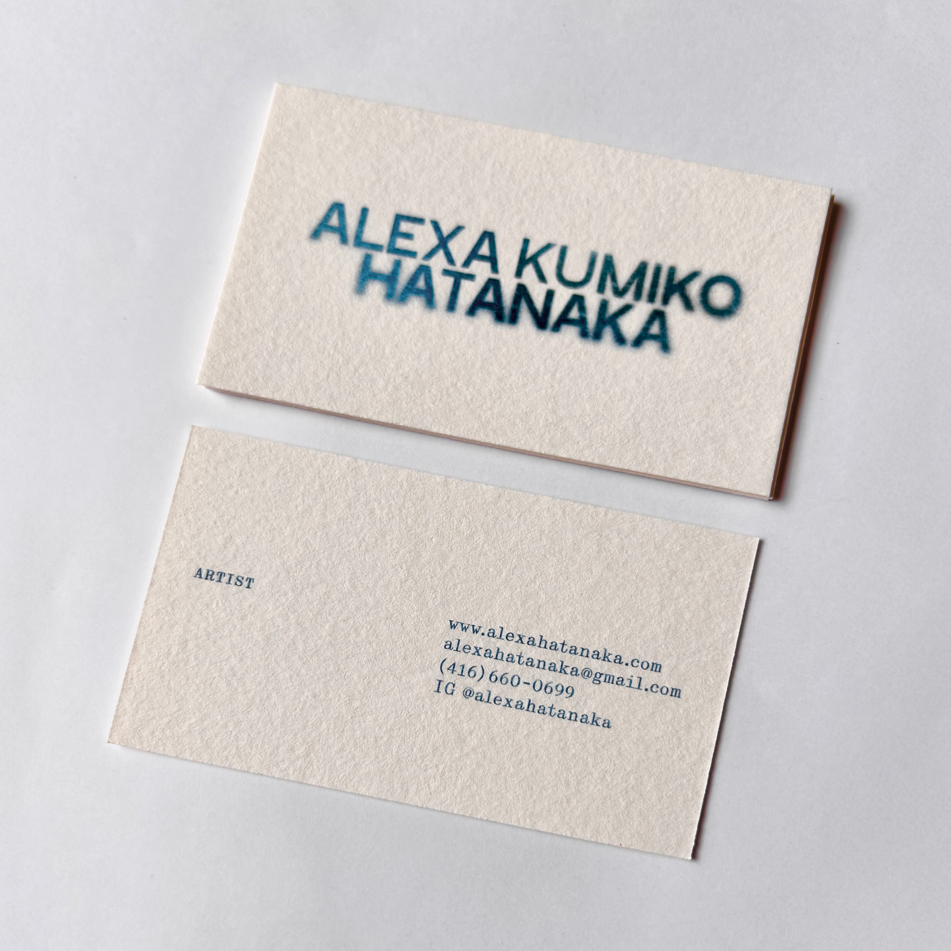
// Business cards.
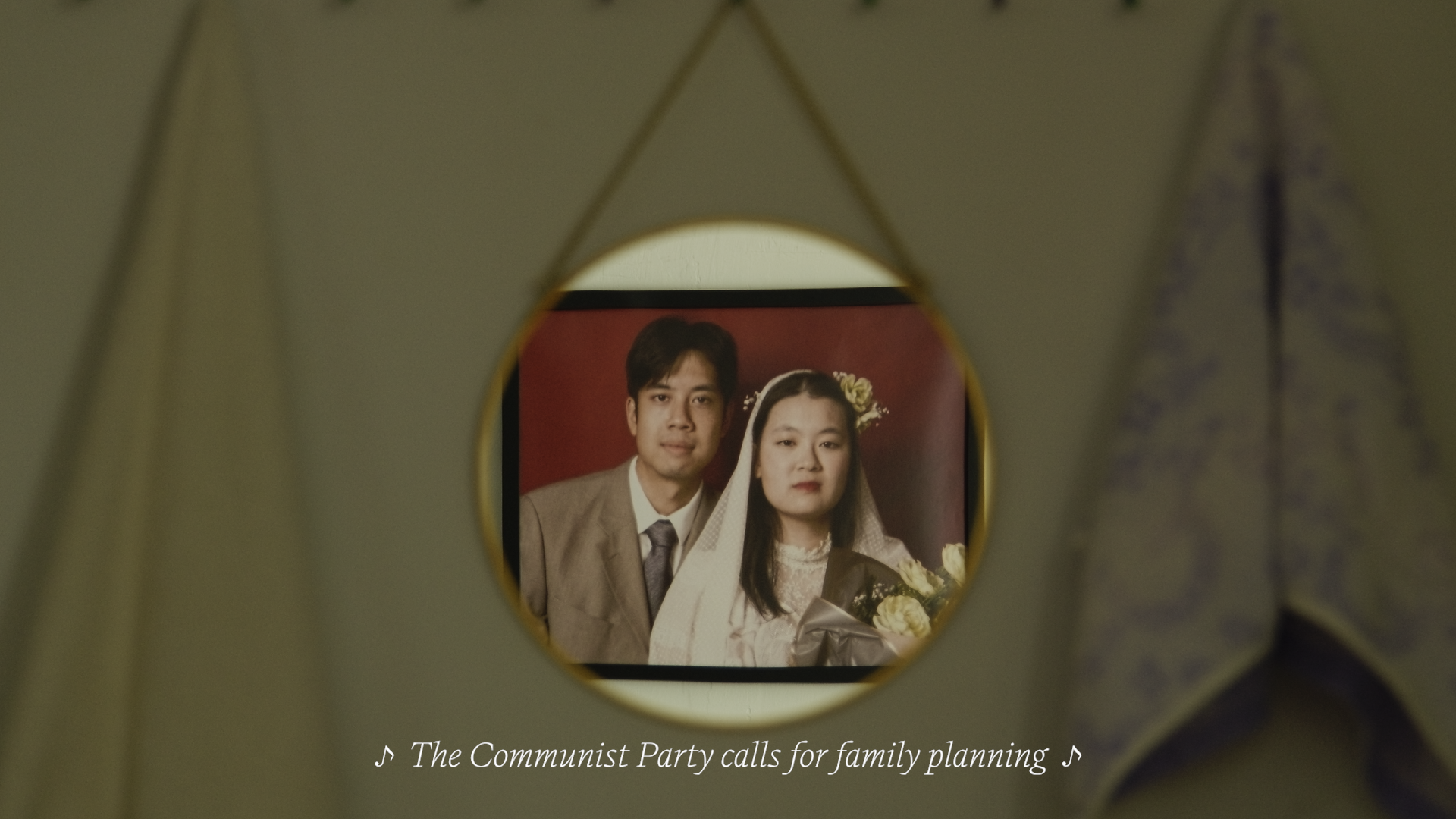
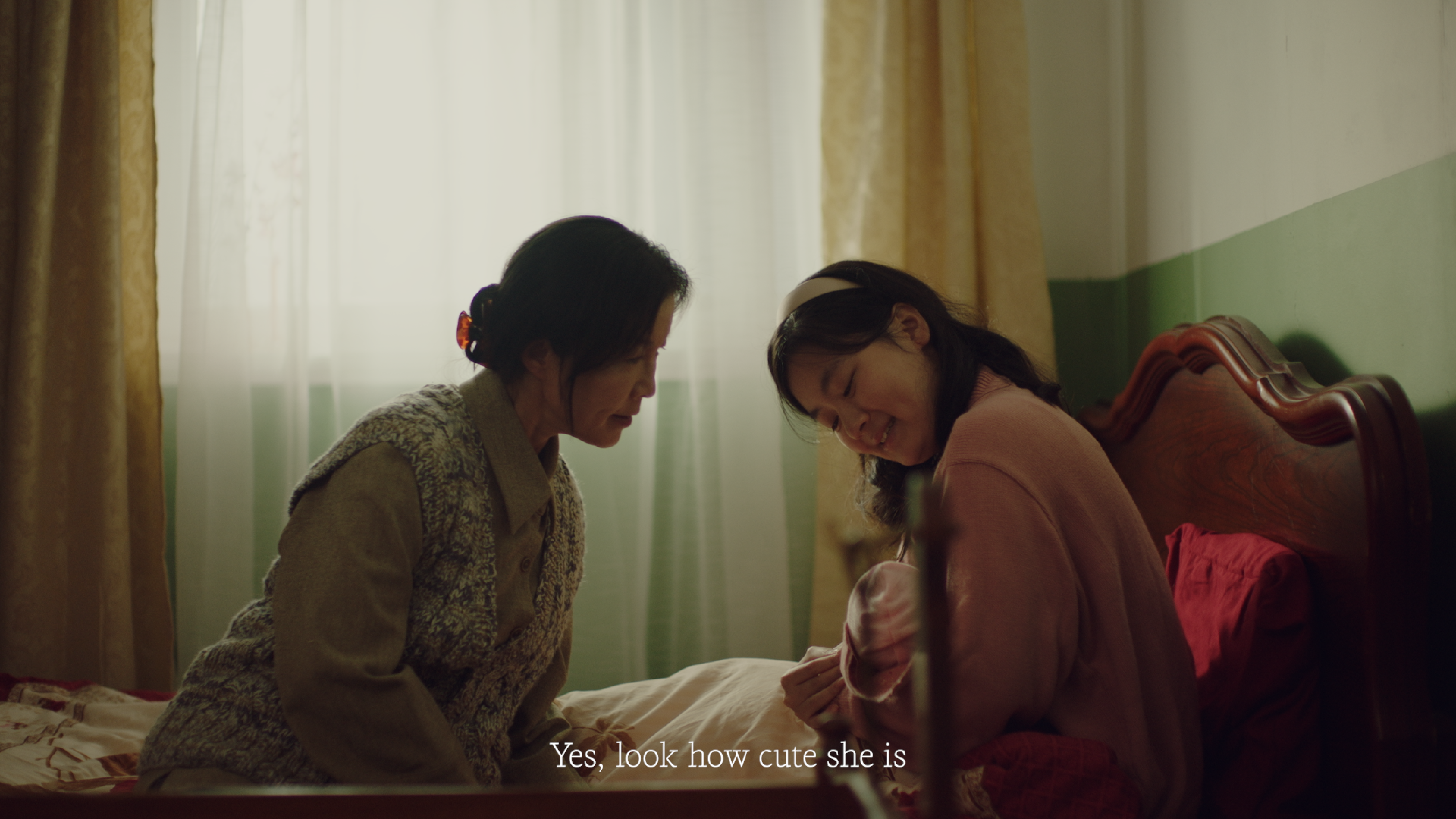
Congratulations, It’s a Girl, 2023
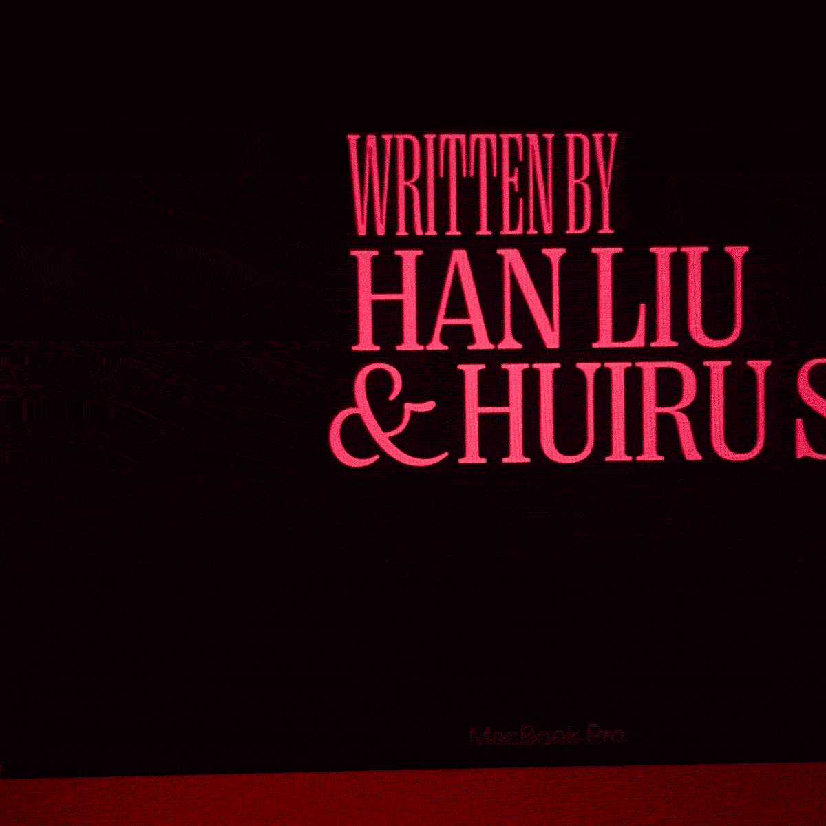
// Title, custom Chinese title type, credits, subtitles, and poster design for Han Liu’s graduating student short film, Congratulations It’s a Girl.
Set in 1990 during China’s One Child Policy, a young new mother, Hong/红, gives birth to a baby girl to her own mother’s disappointment. Though previously promising that it wouldn’t matter whether she had a boy or a girl, Hong’s mother proposes a plan to swap her newborn with another—a second boy born into their family from the countryside.
Typefaces used: Right Serif & Writer by Pangram Pangram for English type.
// Title design.

// Custom Chinese type design.
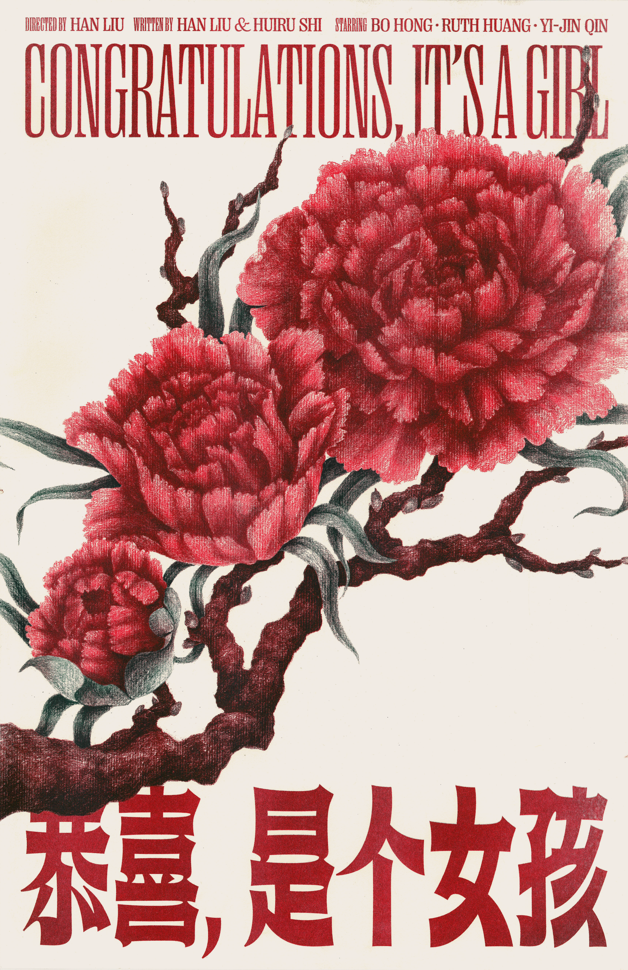
// 2-colour risograph poster. Edition of 50.
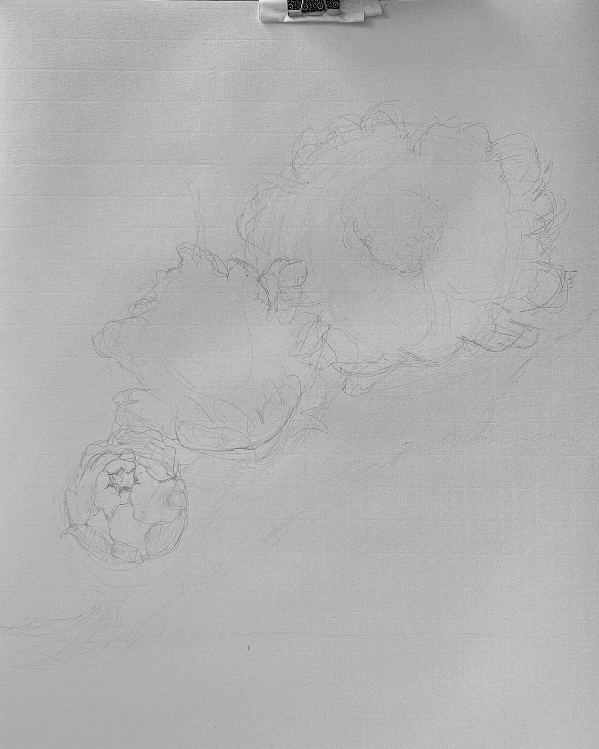
// Pencil illustration process for poster.
// Subtitle design.
// Credits design and motion.
// Custom ampersand for poster and credits.
Florence, 2023
// Title, custom title type, credits, and poster design for Nick Molina’s graduating student short film, Florence.
In a gory dark comedy, a sadistic young woman, Florence, is roped into the schemes of a couple of inept criminals.
Typeface used: Buffon by Dave Coleman for credits & supporting type on poster.
// Title design and motion.
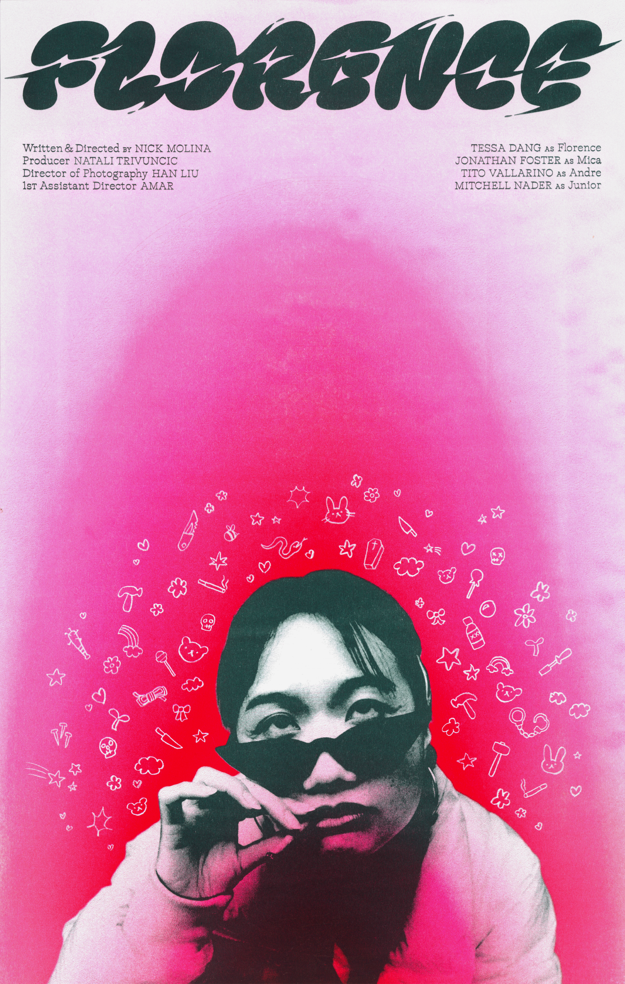
// 3-colour risograph poster. Edition of 25.
// Custom title design.
// Credits design and motion.
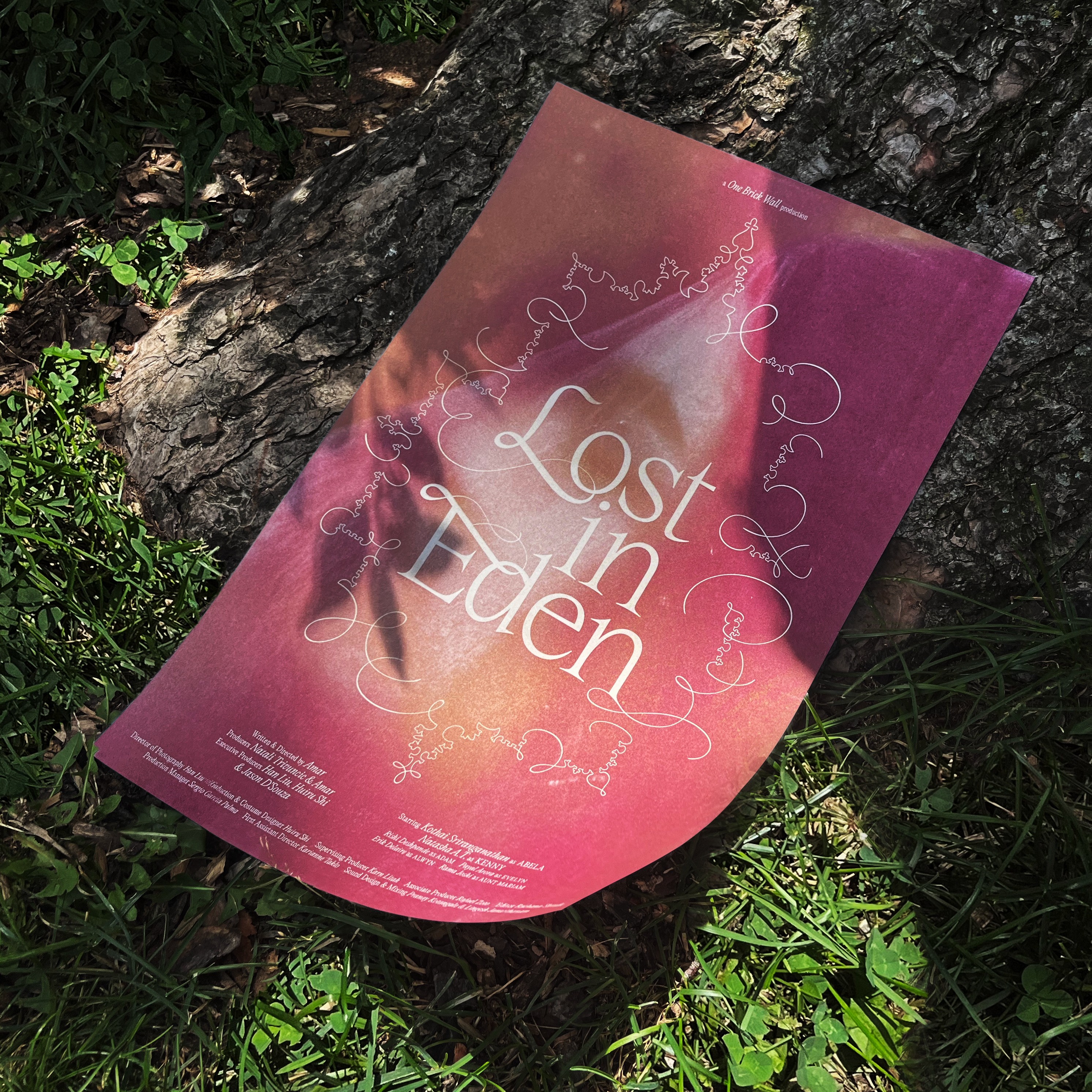
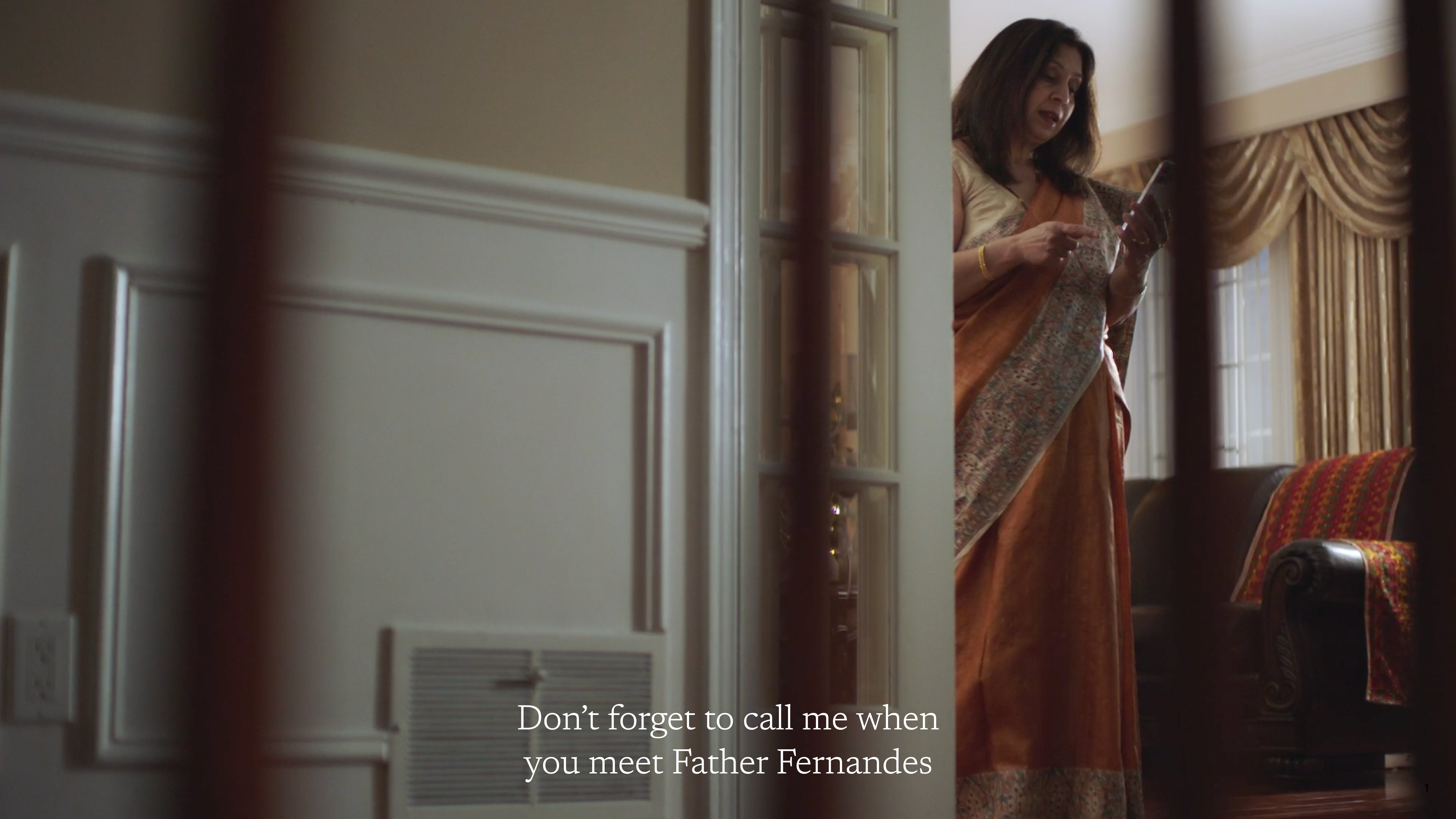
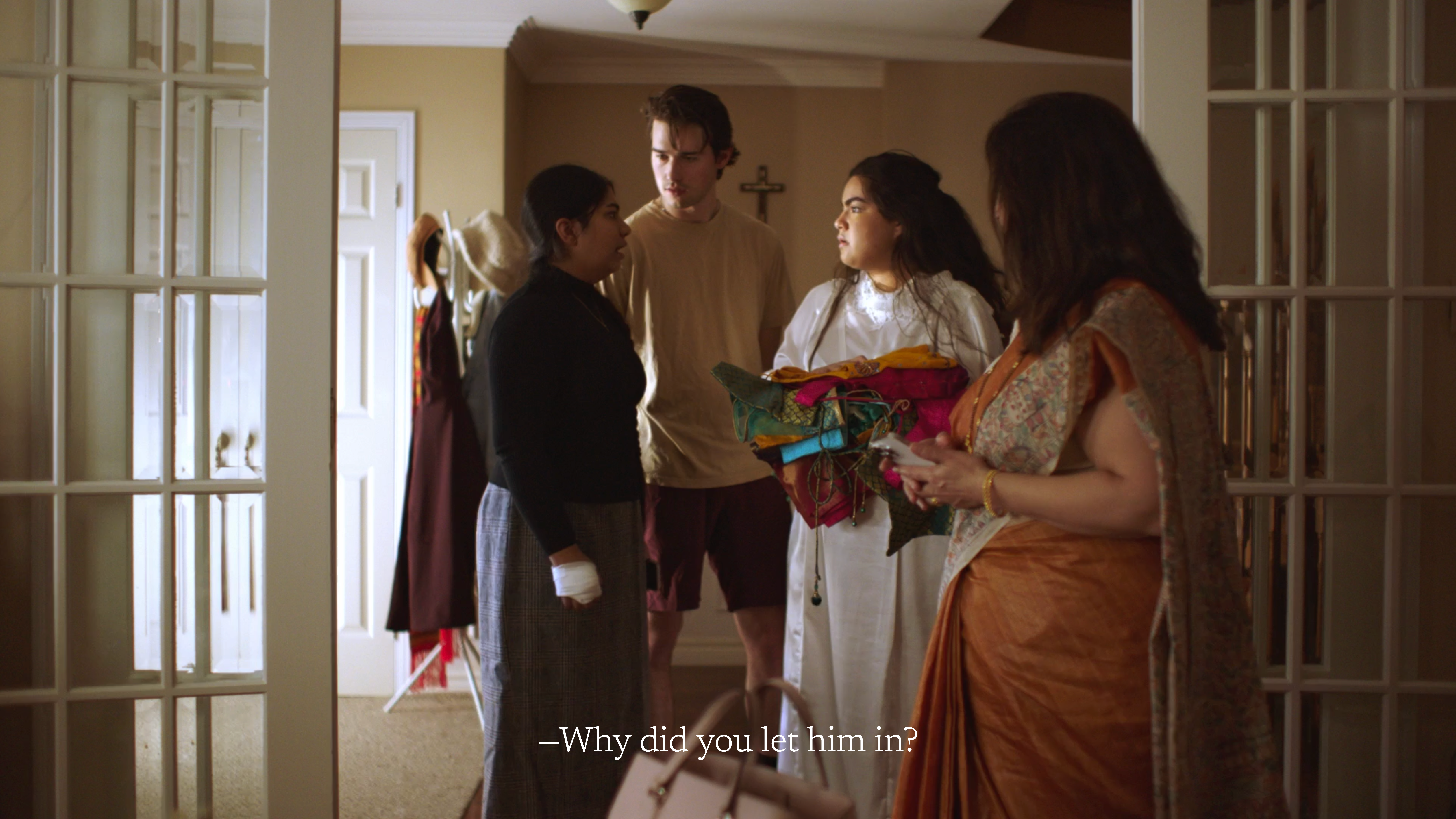
Lost in Eden, 2023
// Title, custom title type, credits, subtitles, and poster design for Amar Shinde’s graduating student short film, Lost in Eden.
Typeface used: Editorial New by Pangram Pangram.
Two sisters, Abela and Kenny, find their relationship strained by traditions and religious norms. While physically distant from their parents in India, Abela still feels suffocated by their conservative expectations. Her dreams are haunted by a mysterious figure wrapped in pink as she becomes more consumed by her envy towards her sister’s confidence and rebellion against their parents.
Fonts used: Editorial New by Pangram Pangram for credits & supporting type on poster and Newsreader by Production Type for subtitles.
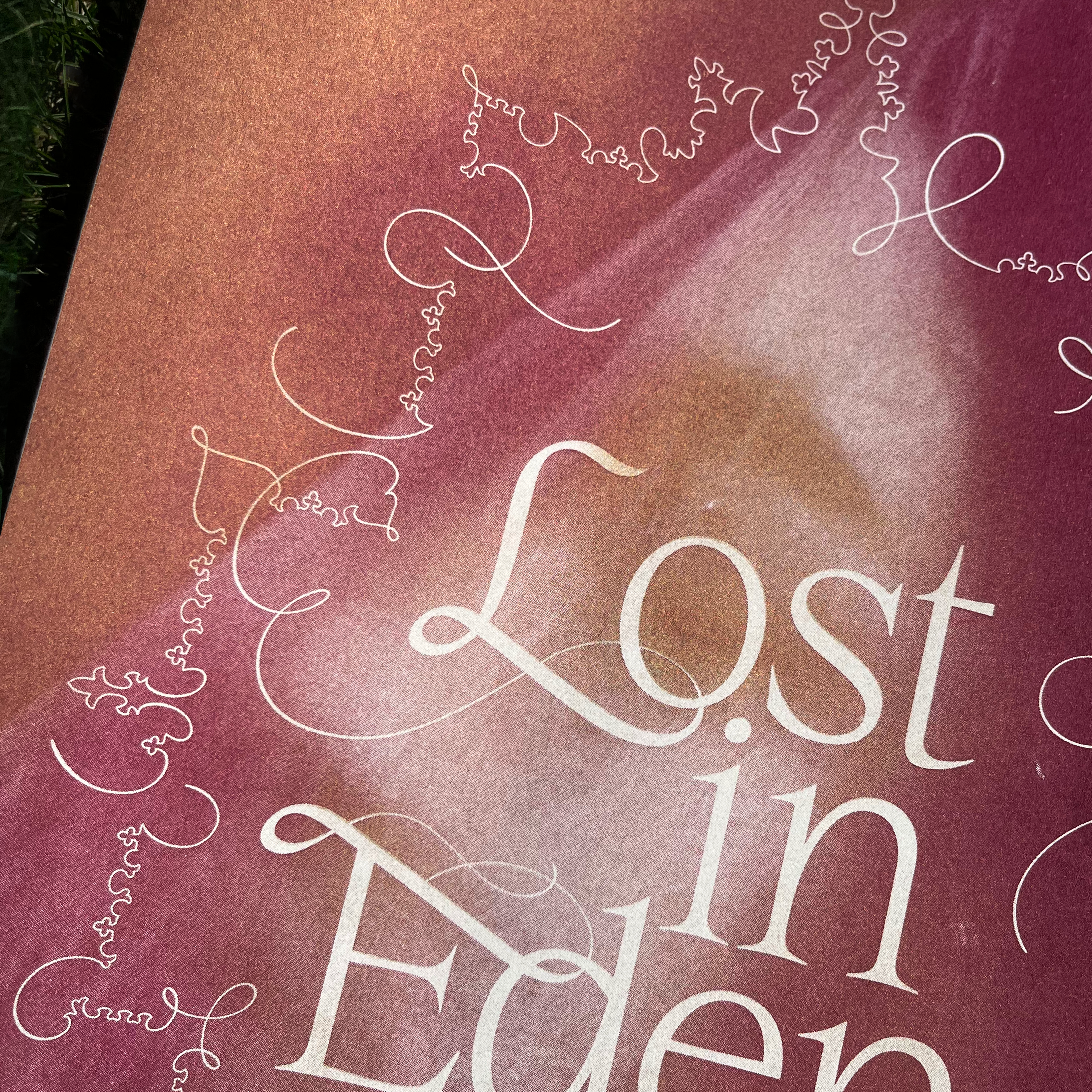
// Title design.
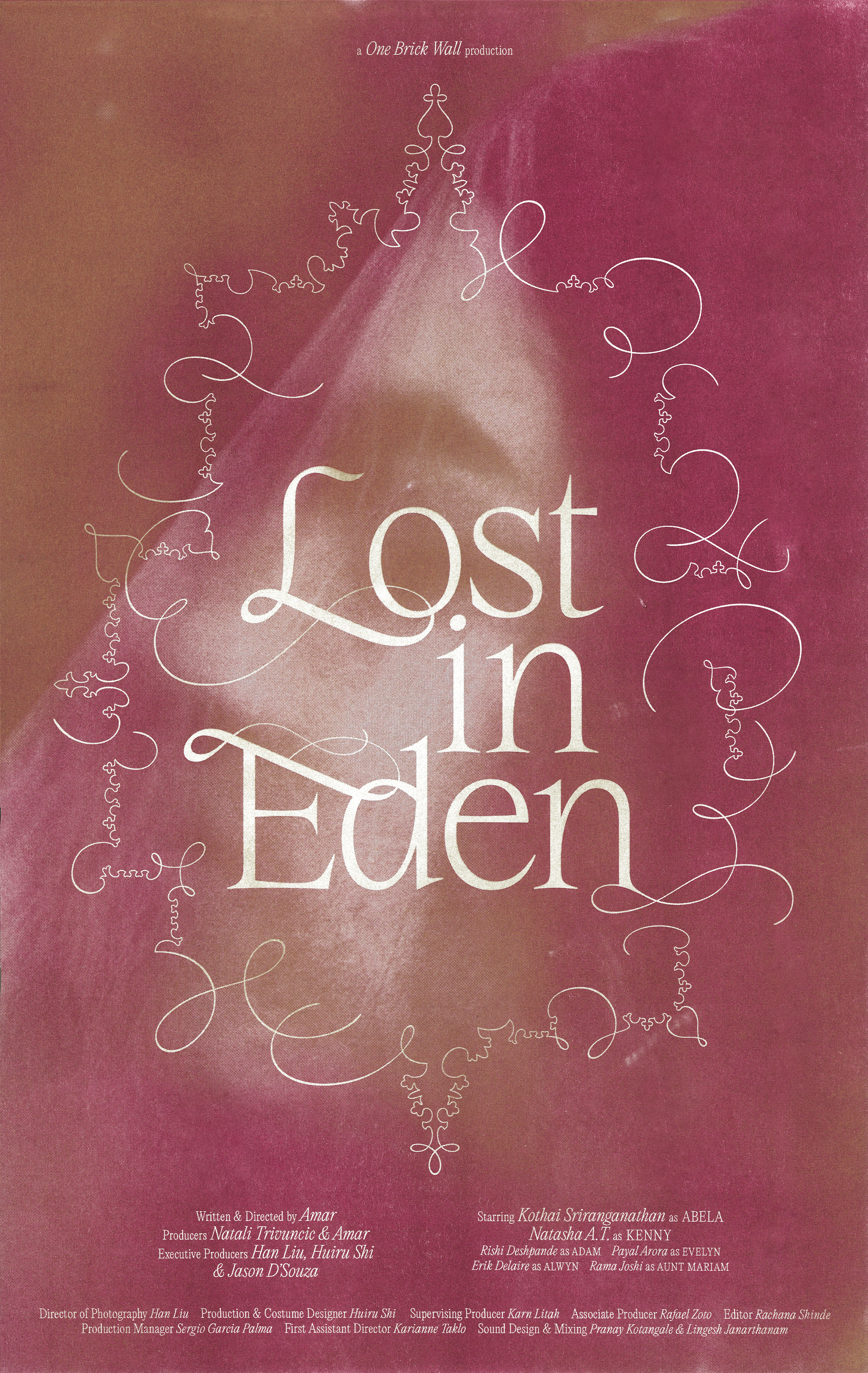
// 2-colour risograph poster. Edition of 25.
// Subtitle design.
// Credits design and motion.
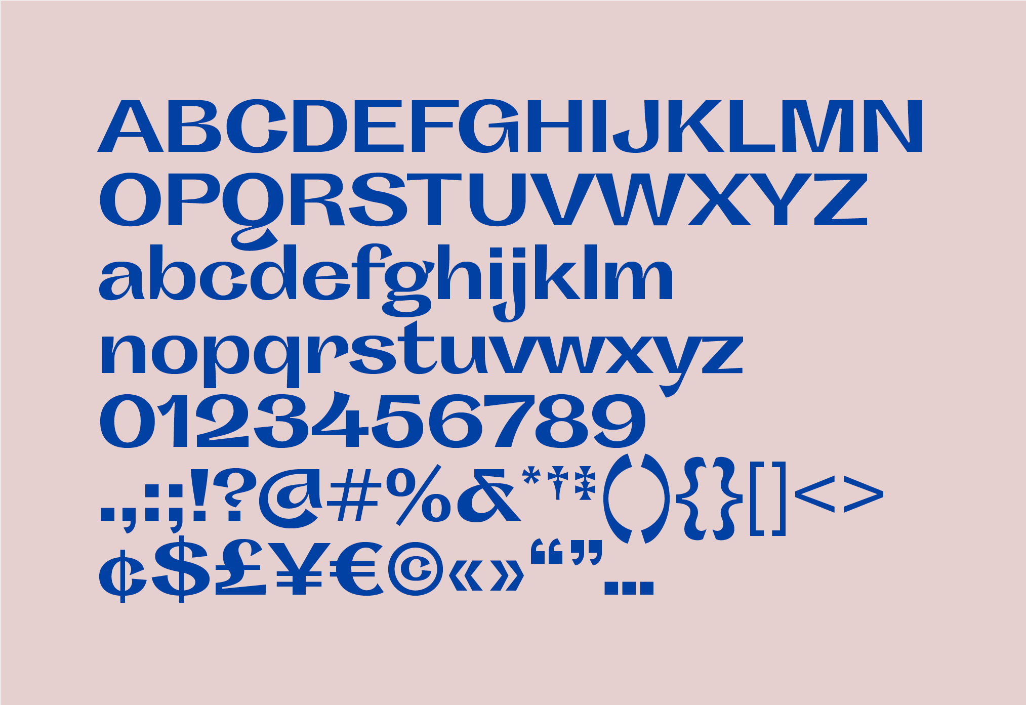
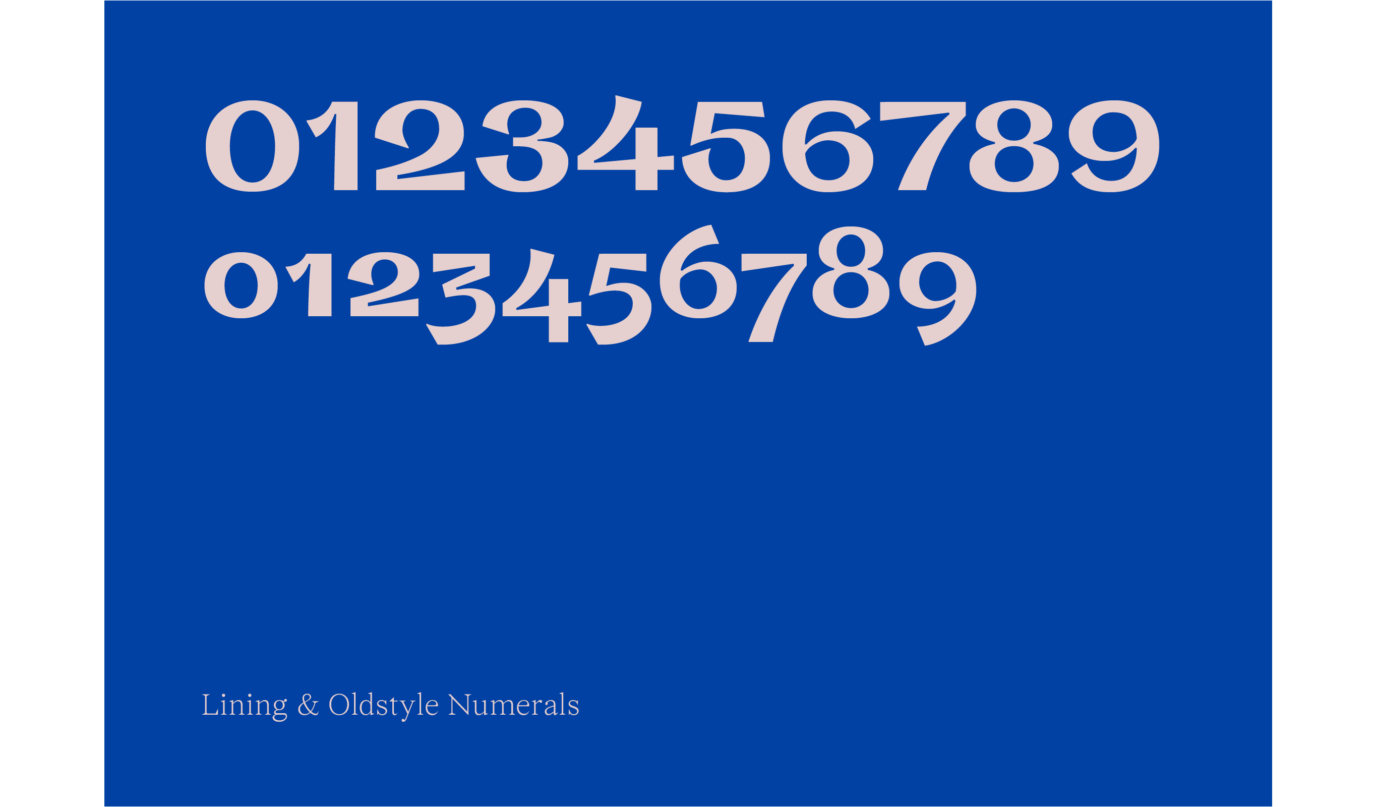
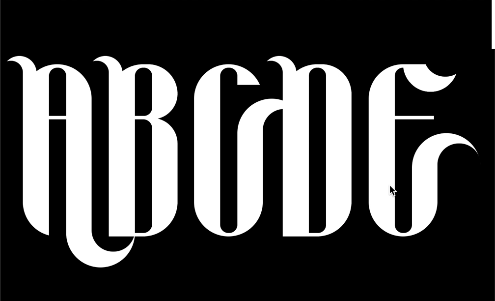
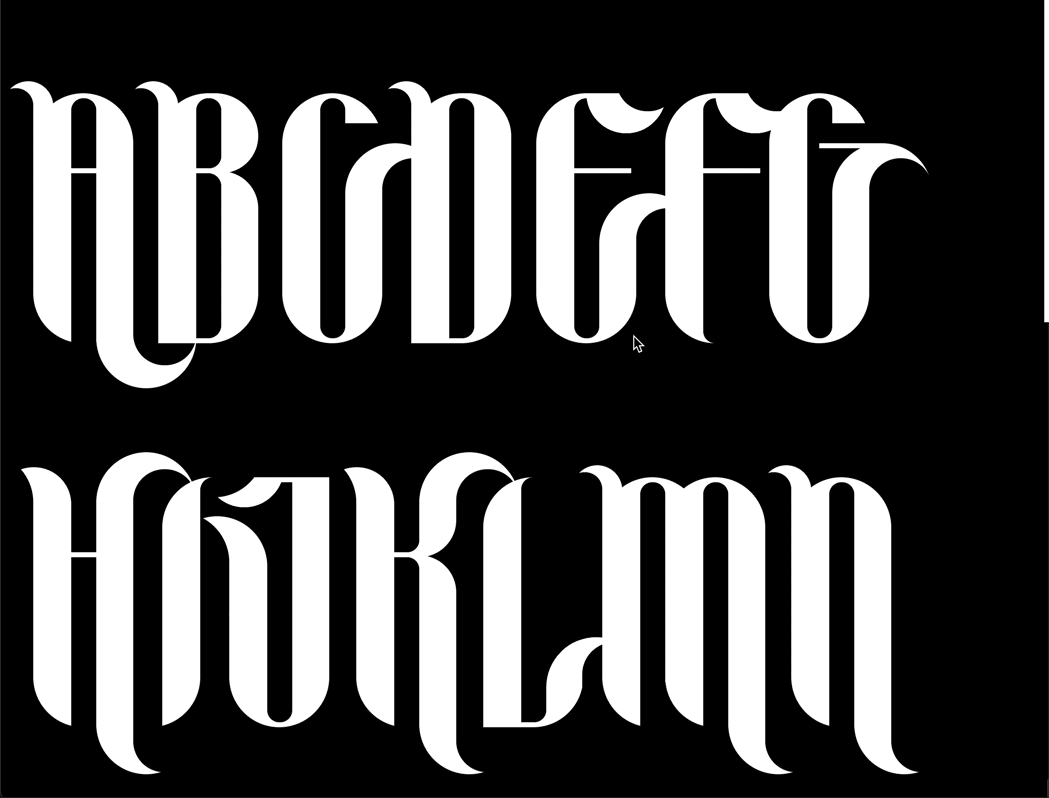
Defunkt typeface, 2020
// Typeface (regular and italic), 16 × 36 in specimen poster.
Swooshes, ink traps, and alternate glyphs galore, Defunkt is a high-contrast sans-serif displayface that carries on the tradition of weird and awkward grotesques. With high-contrast and dramatic strokes, characters slope in and out with gusto to produce unusual and energetic forms. Where strokes are often thin, they are thick; where they are usually wide and strong, forms are pinched and narrow; letterforms shrink, grow, and confidently flare out.
Large &
in charge
“Chunky
yet
funky”
Bold
*and* beautiful!
•
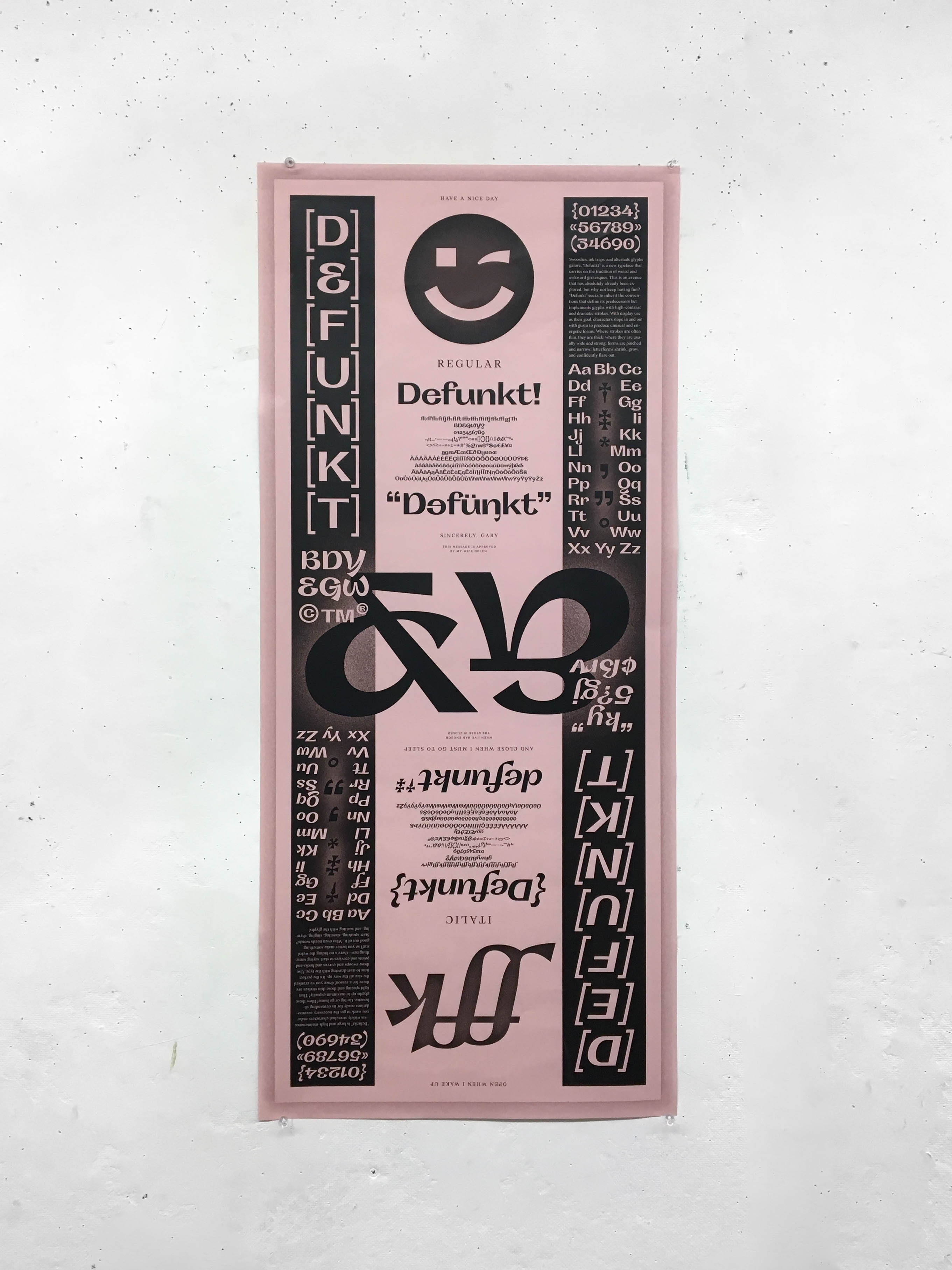
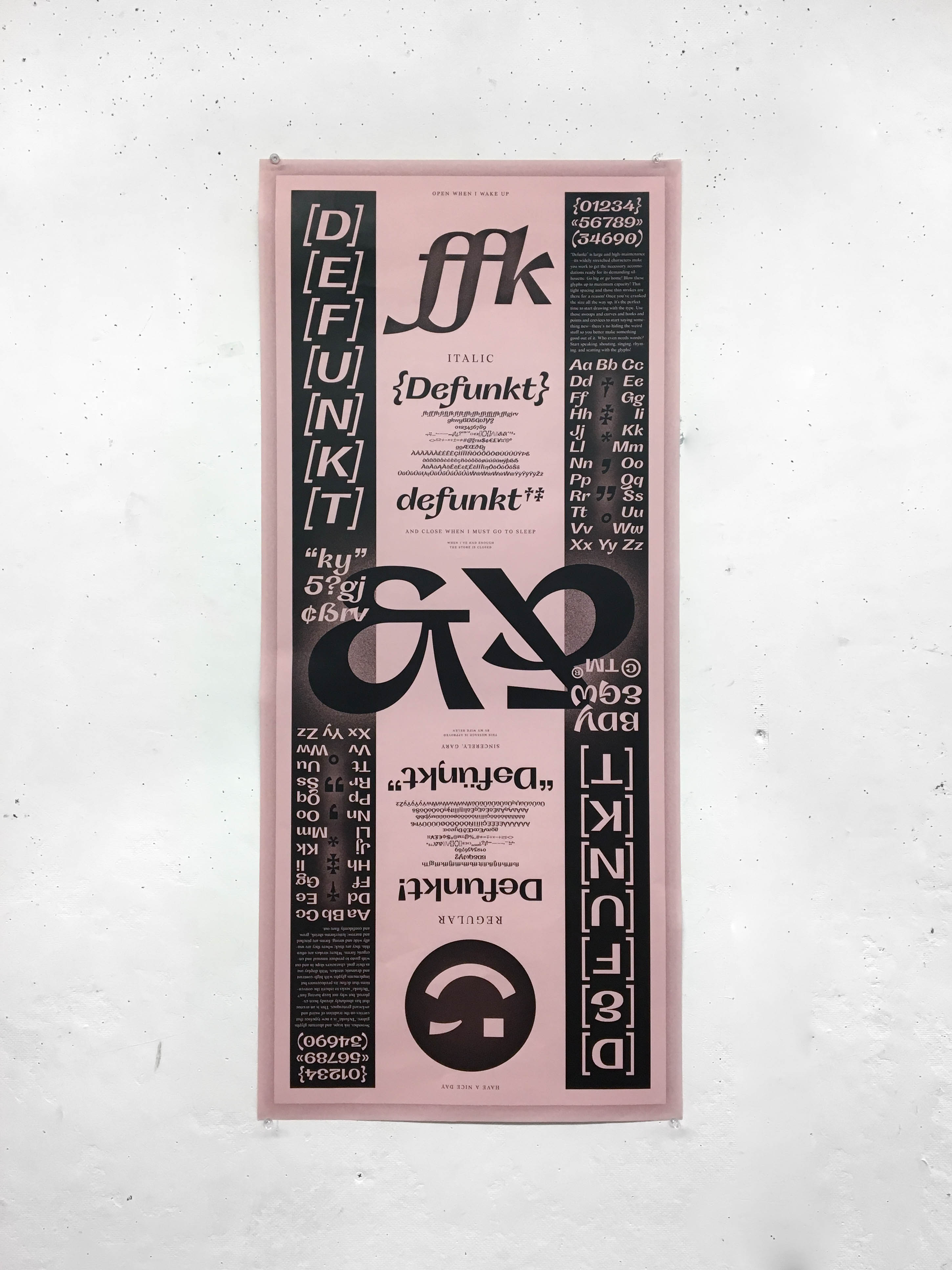
// Type specimen poster, 2019.
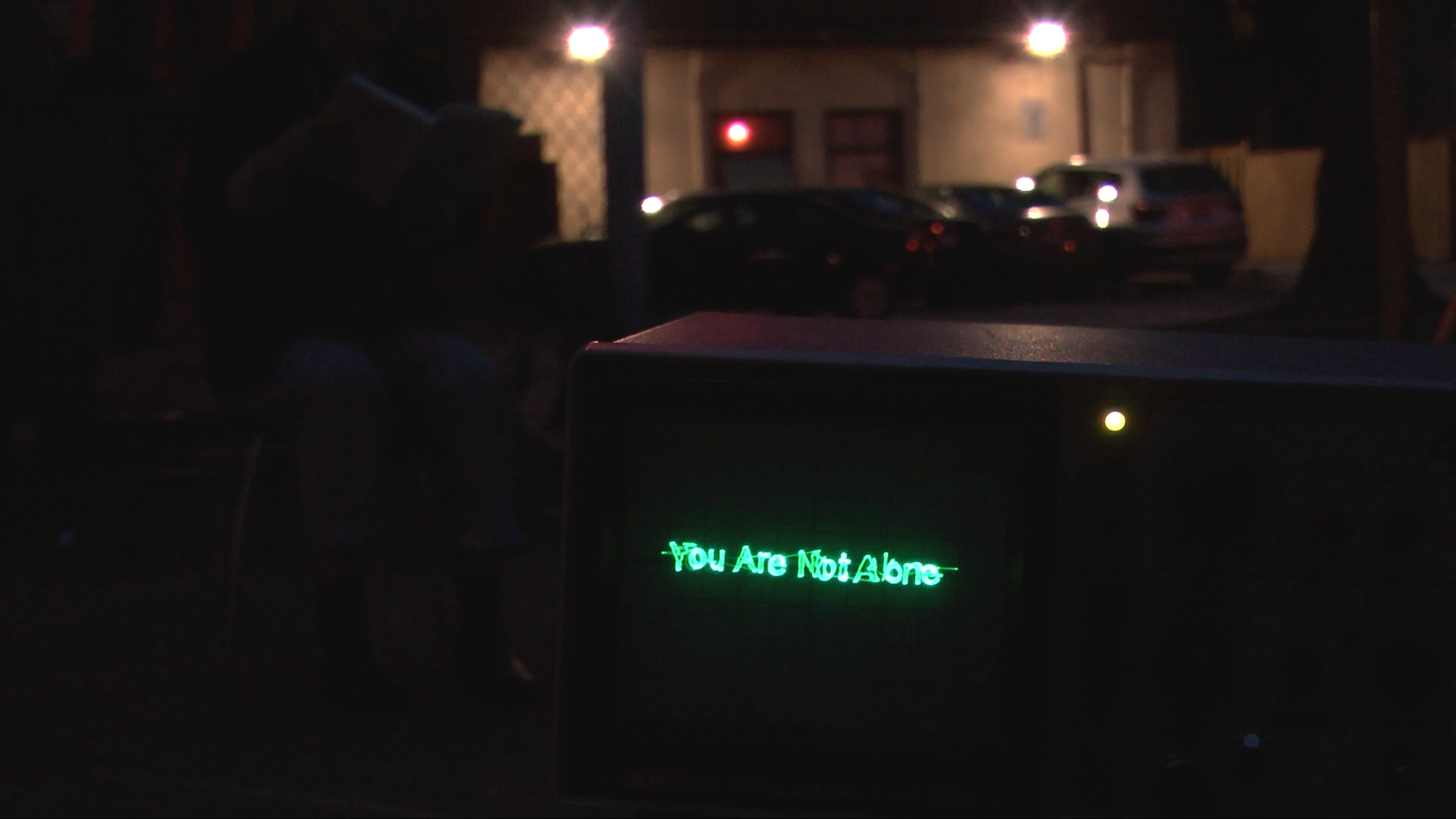
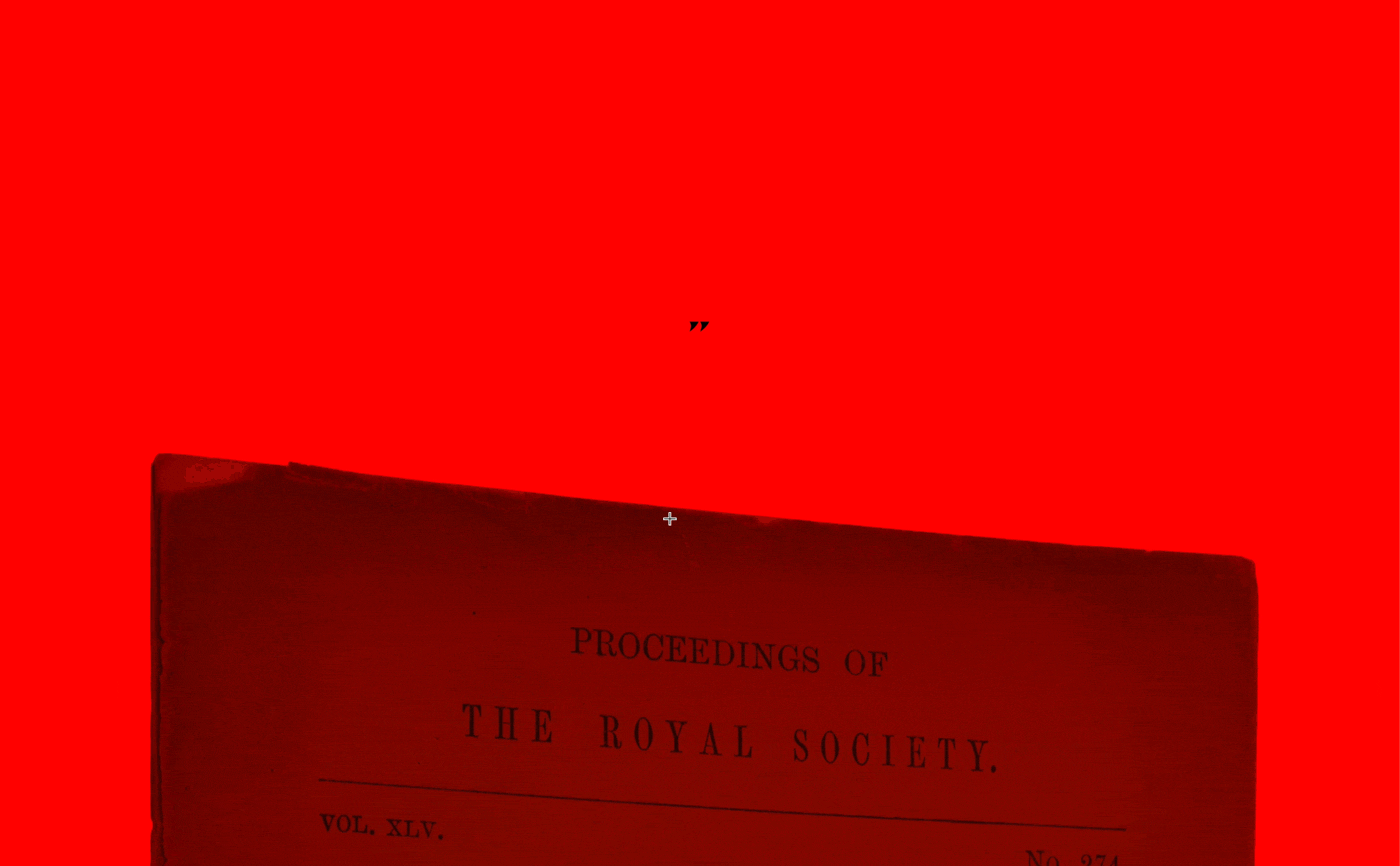
Grave Eternity, 2019
// Multimedia installation, participatory performance, and live web-scraping page.
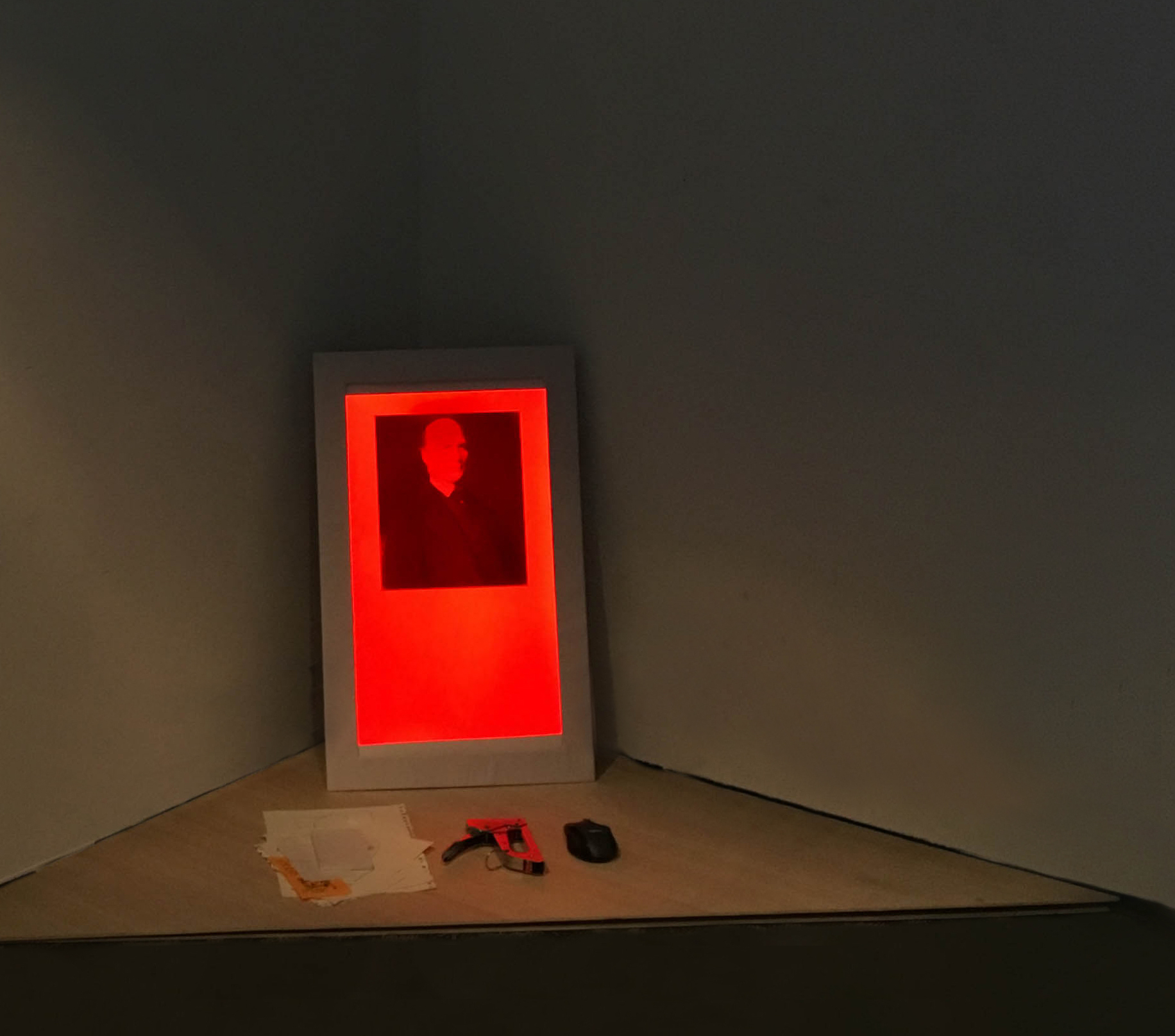
Grave Eternity is a web-based installation and performance piece that requires participants to take a few minutes to respond to a portrait of the man featured in the framed monitor through drawing or writing. People’s contributions are collected and violently attached to the wall with a staple gun while kneeling in front of the monitor, surrounding the frame with eclectic and mostly uninformed reactions to the subject of the image.
The performance is accompanied by a live web page displayed on a vertically-oriented and framed monitor placed in the corner as the centrepiece of an “anti-shrine”. The page uses web-scraping to collect the current Google image search results for “Francis Galton” and intersperses said images with text pulled from Galton’s Wikipedia page.
// A condensed video documentation of the performance.
// The installation before the performance began: in front of the portrait of Francis Galton are a pile of previous audience contributions, a staple gun, and a computer mouse.
Francis Galton, one of the early contributors of racial sciences and creator of term eugenics—the practice of correlating physiology to intellect and taking action and affecting policy to reflect their beliefs. This piece is an act of disenchantment towards Galton—an “anti-shrine”, unceremonious and misinformed. It removes the power of controlling his own public perception by re-appropriating his image and his personal history to endlessly loop and generate. Similarly to how the photos of anonymous individuals documented during expeditions rest in archives or databases completely separated from any shred of their actual humanity or real self, I have created a ritual and “alter” to create the same experience for this scientist, no longer allowing his image rest peacefully. This work is a part of my undergraduate capstone project that addresses the issue of disinterring history and speaking about the pain of others.
// The Google image results of and Wikipedia article text for Francis Galton. View a static archive of web-scraped text and images captured at the time of the performance here.
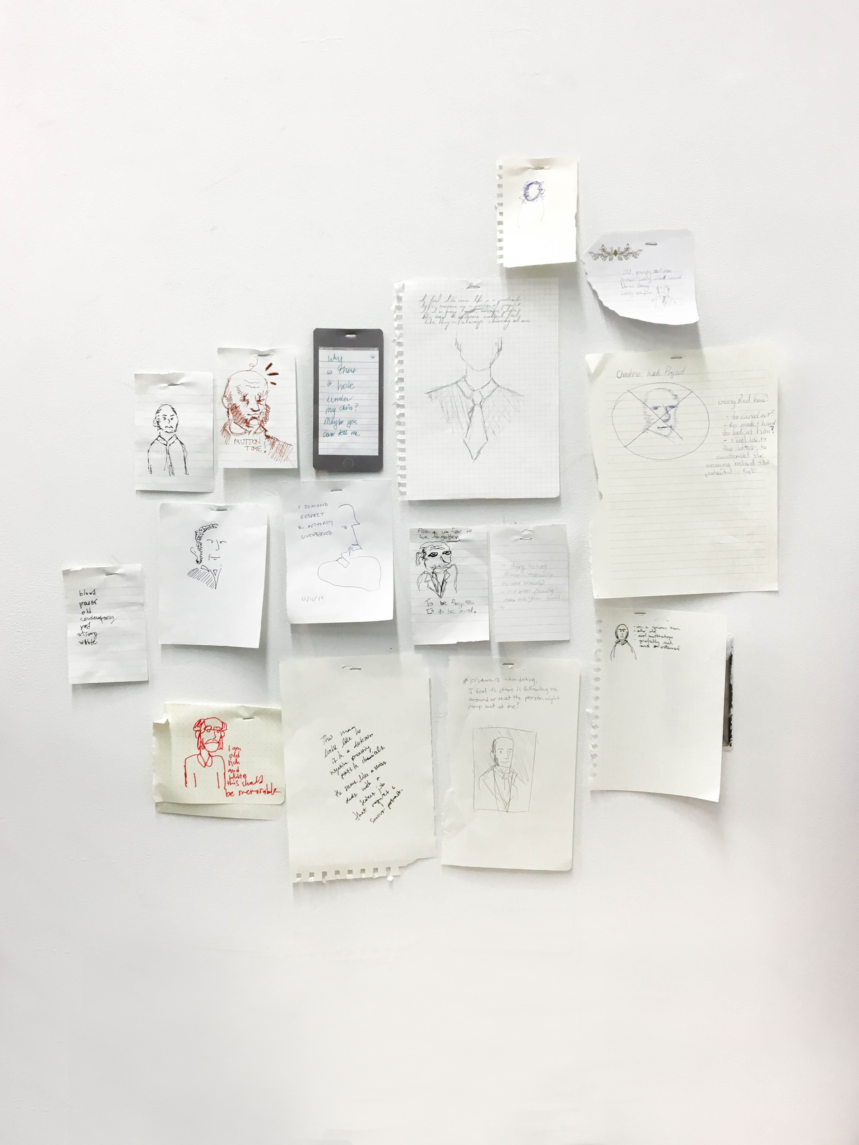
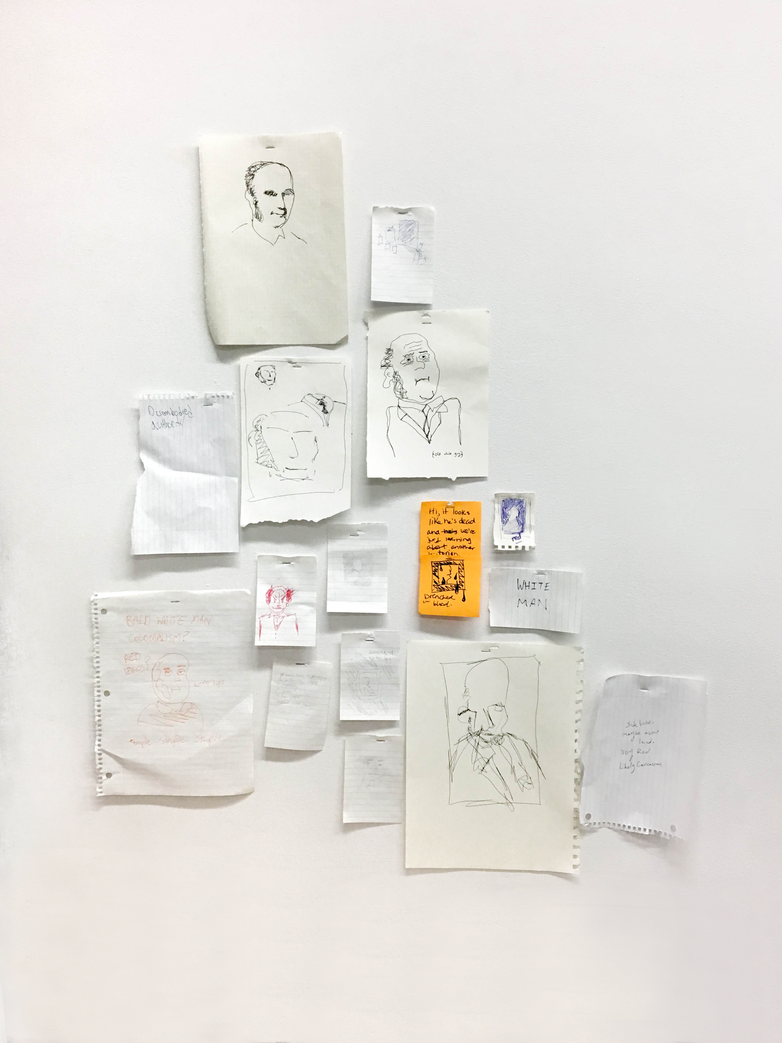
// The audience’s contributions to the performance.
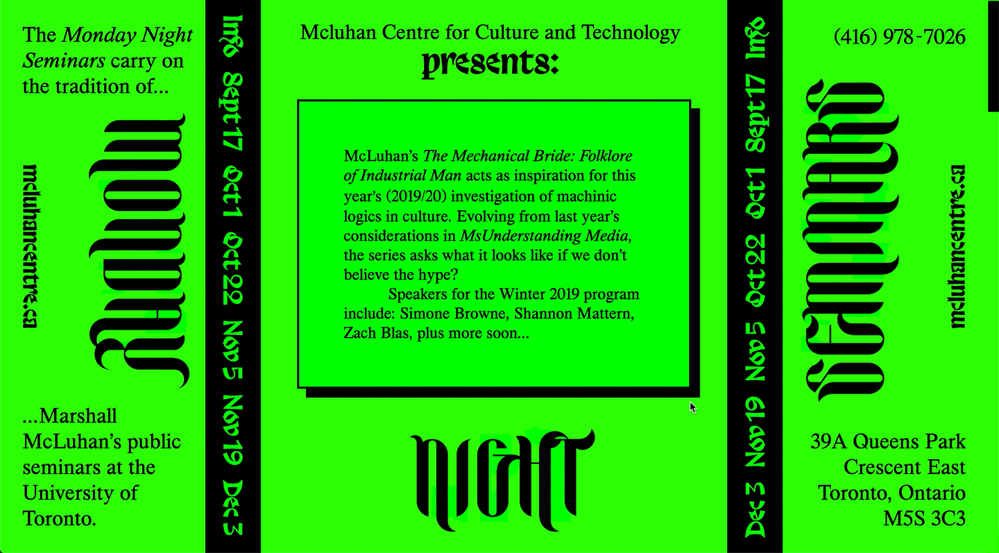
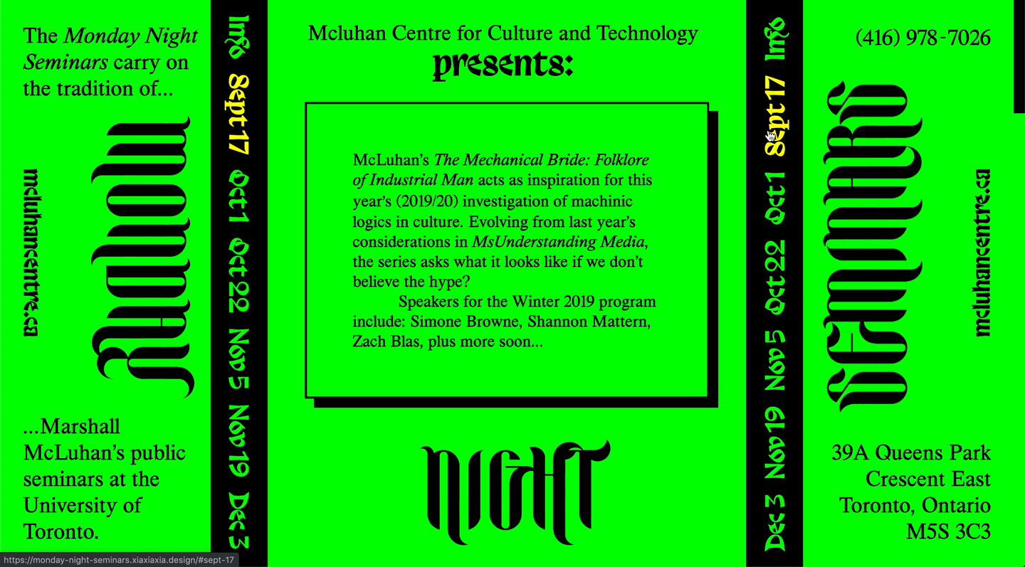
Monday Night Seminars, 2019
// Single-page website poster.
This site is a web-poster made to promote a hypothetical series of events for Monday Night Seminars presented by the McLuhan Centre of Culture and Technology. With the series being inspired by McLuhan’s The Mechanical Bride: Folklore of Industrial Man, the idea of an ‘industrialized folklore’ seeped into the the composition, selected typefaces, choice of colour, and user interaction. Rather than this “folklore” being based in distant stories from the past, the types of cultural narratives McLuhan addresses in his essays looks to technology and the popular culture that has grown around it.
Leaning into this modern folklore theme, a composition with heavy typographic ornamentation, a web-based display face, another calligraphic typeface, a modern re-cut of Times New Roman, and a more “digitized” book reading experience with the use of stick elements that you flip/scroll through. The chaotic interactions are meant to make the users hyperaware of their engagement with the large amounts of content they are presented with, reflecting the arguments in The Mechanical Bride. This leads back into the seminars which all address different ways in which we can begin to tackle, disassemble, and take control over the overwhelming and over-growing techno-culture that surrounds us.
View the full website here (best experienced in Chrome).
// The background colour is tied to user’s mouse speed, making the page glow and flash with any fast movement.
// Details on the speakers are hidden until the user hovers over them and the large titles that say ‘Monday Night Seminars’ expand and deteriorate, revealing how the letterforms were made.
大哥 (dà gē), 2019
// Interactive installation (camera, framed monitor, sound).
Images of Mao Zedong’s face have been collected from a wide and expansive collection of propaganda posters created during the former chairman’s time of governance over the People’s Republic of China. These depictions of his likeness range from wise and stoic to joyous and loveable. Here in this installation—just as his portrait looks over Tiananmen Square—this digitized version of Mao’s image follows the viewer, connecting the digital surveillance experienced in modern-day China to a physical experience.
The installation used a camera and figure/motion detection to track the viewer’s position and distance from the framed digital portrait. As the viewer moves from left the right, the portrait’s direction follows, allowing other spectators to get a clear view of the relationship and interaction between person and the image on the screen. The country’s national anthem plays on repeat, only increasing in volume when the user steps away to get the “bigger picture”, while being closer to the installation lowers the volume, making this overt display of nationalism fade away into the background.
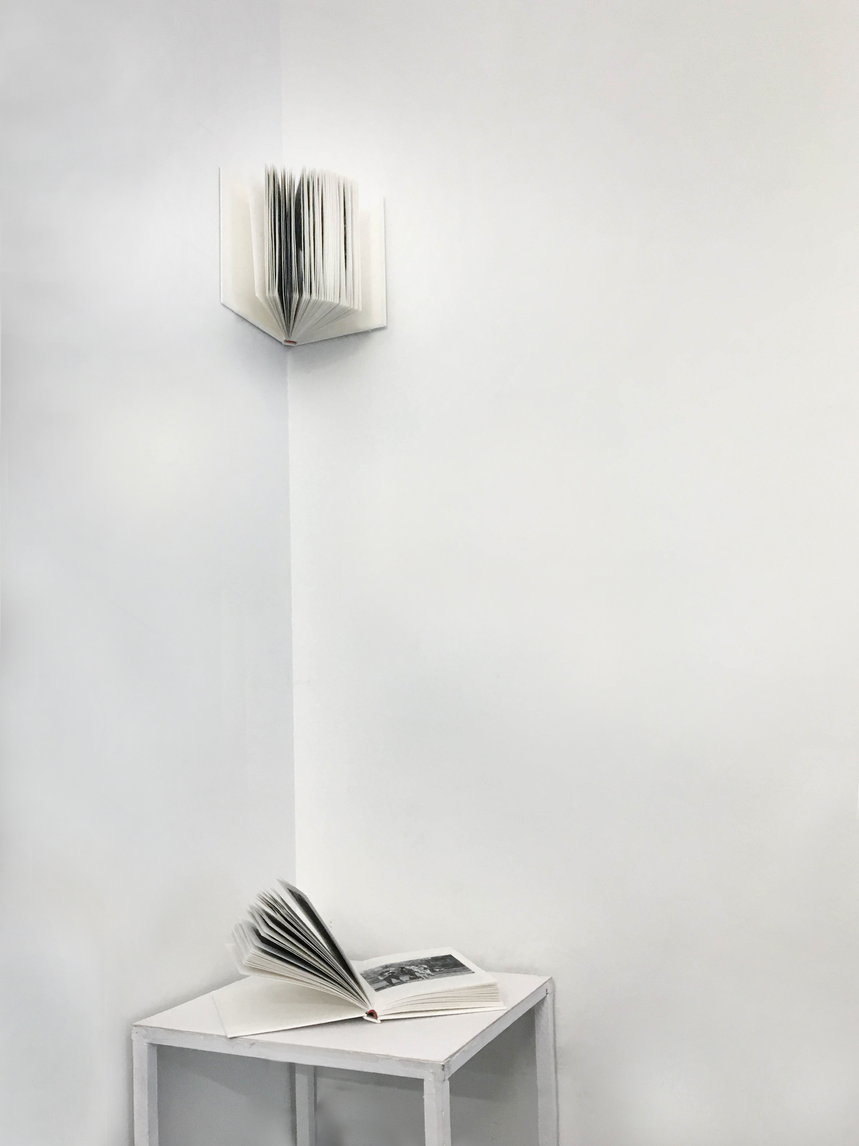
Essentially Anonymous, 2020
// A pair of handbound 5 × 7 in hardcover books.
Essentially Anonymous is a two-part installation comprised of two books, one that can touched and flipped through and another that is out-of-reach and unknowable. Both books are comprised of expedition photographs collected from the American Museum of Natural History’s digital archives; the untouchable book in the corner is filled with nameless photographs of people taken by researchers during these expeditions while the in-reach book puts the faces of said researchers on display for viewers to examine. These images are interspersed with a poem addressing the conflicts within the act of speaking for others and documenting experiences outside of your own. This work is a part of my undergraduate capstone project that addresses the issue of disinterring history and speaking about the pain of others.
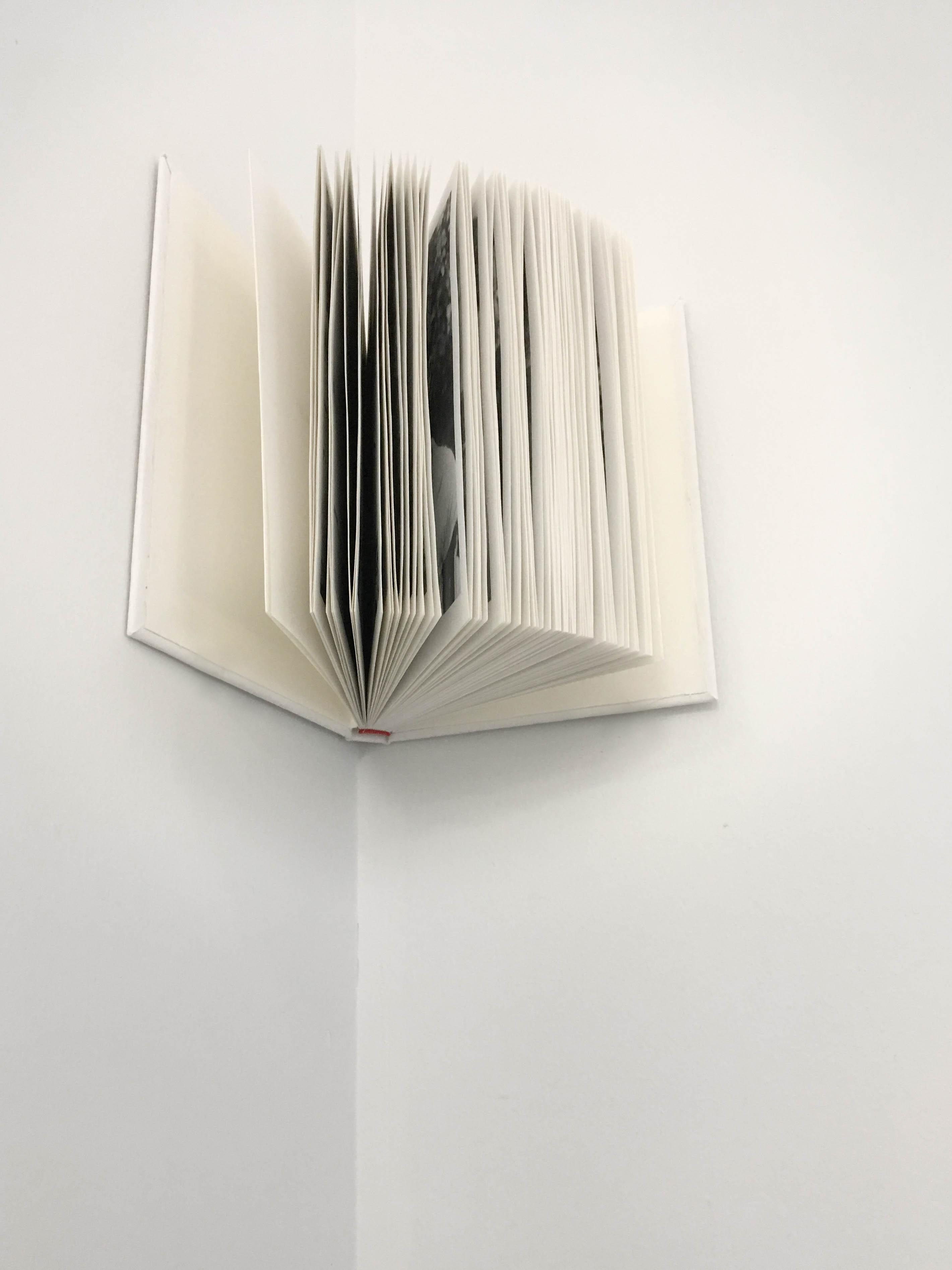
// The untouchable book filled with portraits of anonymous individuals. Their portraits only barely peak out through slivers between each page.
The untouchable book rests above the viewer’s head, with its pages almost out of sight, positioned in the icon corner to pay a modest tribute to these anonymous individuals by transforming the book they reside in into a type of worship space or alter. Instead of their anonymity taking away from their individuality, this type of anonymity removes these people’s faces and bodies from display altogether and returns the control of visibility back to these individuals. In contrast, the book that viewers are able to touch and see is filled with images of the expeditioners, the ones that have performed questionable acts of documentation. Both books are nearly identical: same number of pages, same text, same size. The only difference is the portraits that have been swapped out. With antiquated and unethical anthropological research practices often putting the most vulnerable people on display, this pair of books does the opposite by putting the perpetrators on display.
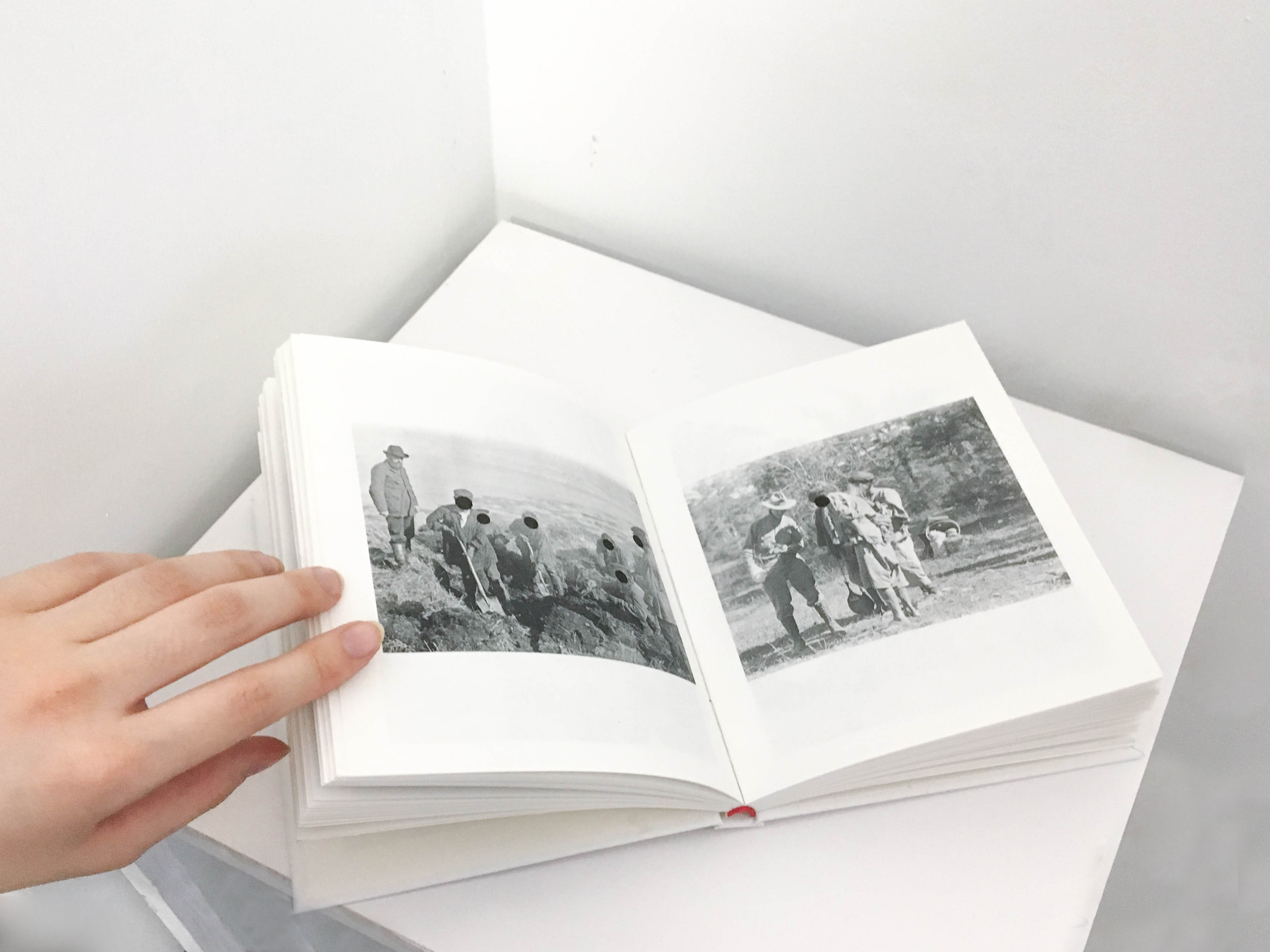
// The touchable book filled with portraits of expeditioners and researchers funded by the American Museum of Natural History. Due to some of these photos including the faces of local guides or other individuals not affiliated with the museum there are black circles throughout the book that censor these people’s faces.
Below is the poem that is woven between the portraits within each book:
You do not know me and I can never know you.
I want to be seen but I do not want to be watched.
I do not want to be watched but I want to be visible.
I want to be visible but I do not want to be surveilled.
I do not want to be surveilled but I want to be present.
I want to be present but I do not want to leave my past.
I do not want to leave my past but I want to grow.
I want to grow but I do not want to leave.
I do not want to leave but I want to explore.
I want to explore but I do not want to overstep.
I do not want to overstep but I want to understand.
I want to understand but I do not want to judge.
I do not want to judge but I want to make connections.
I want to make connections but I do not want to be vulnerable.
I do not want to be vulnerable but I want to be receptive.
I want to be receptive but I do not want to be naive.
I do not want to be naive but I want to admire.
I want to admire but I do not want to stare.
I do not want to stare but I want to be curious.
I want to be curious but I want to be respectful.
I want to be respectful but I do not want to be governed.
I do not want to be governed but I want to belong.
I want to belong but I do not want to lose myself.
I do not want to lose myself but I want to participate.
I want to participate but I do not want to perpetuate.
I do not want to perpetuate but I want to create momentum.
I want to create momentum but I do not want to be misguided.
I do not want to be misguided but I want to demystify.
I want to demystify but I do not want to expose.
I do not want to expose but I want to speculate.
I want to speculate but I do not want to exploit.
I do not want to exploit but I want to wonder.
I want to wonder but I do not want to misinform.
I do not want to misinform but I want to educate.
I want to educate but I do not want to overshare.
I do not want to overshare but I want to be vocal.
I want to be vocal but I do not want to silence.
I do not want to silence but I want to be represented.
I want to be represented but I do not want to be captured.
I do not want to be captured but I want to be remembered.
I want to be remembered but I do not want to live forever.
I do not want to live forever but I want to live forever.
I want to live forever but I do not want to live forever.
I do not want to live forever but I want to live forever.
May your image rest peacefully.
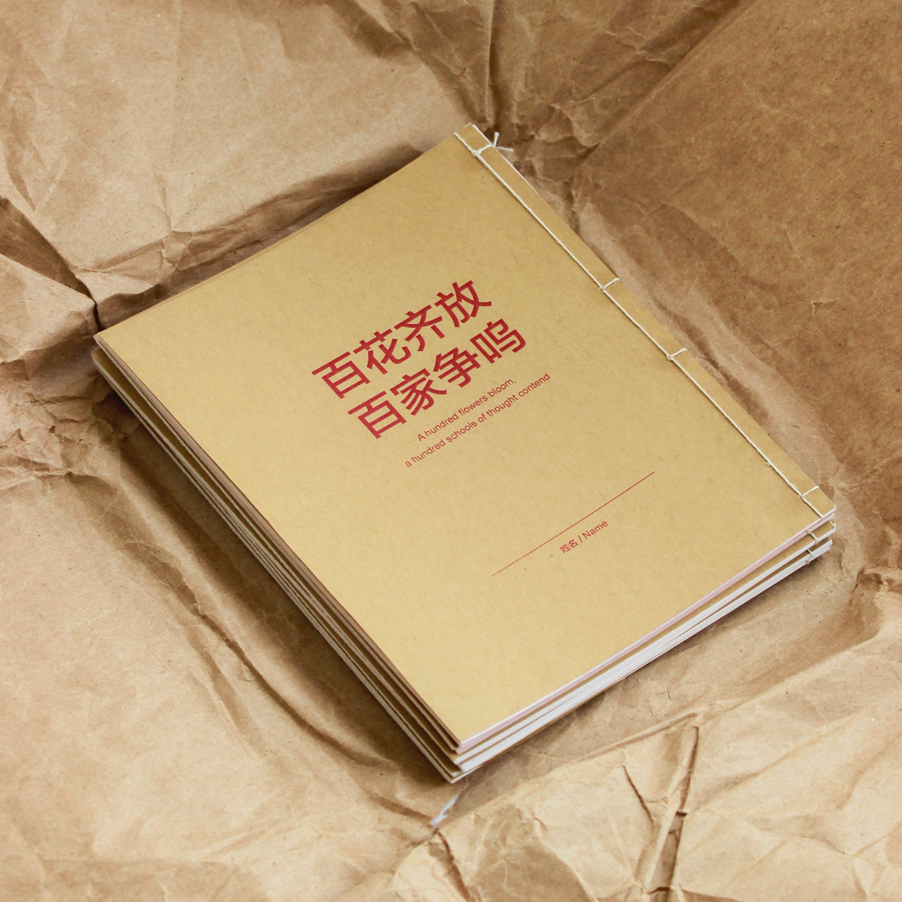
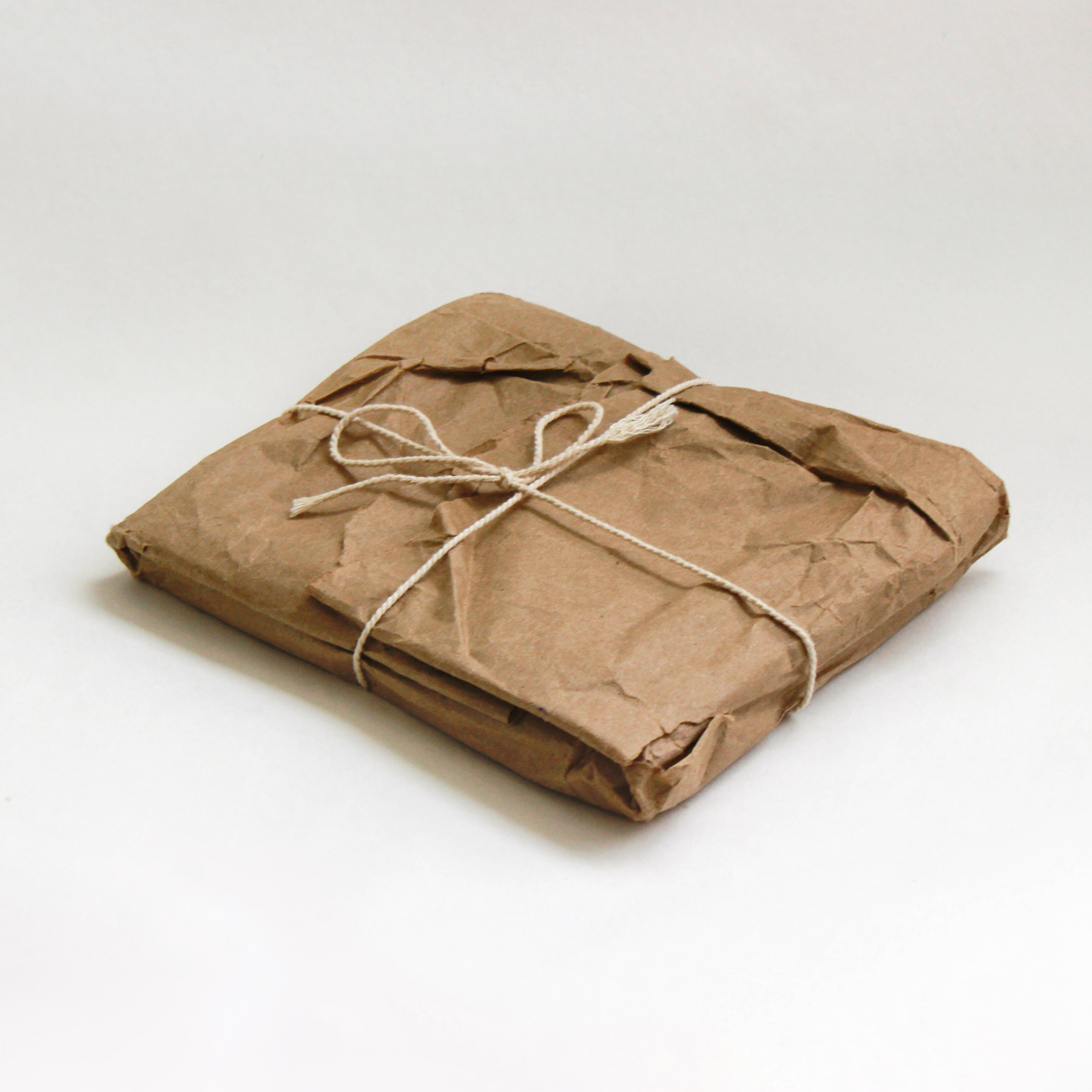
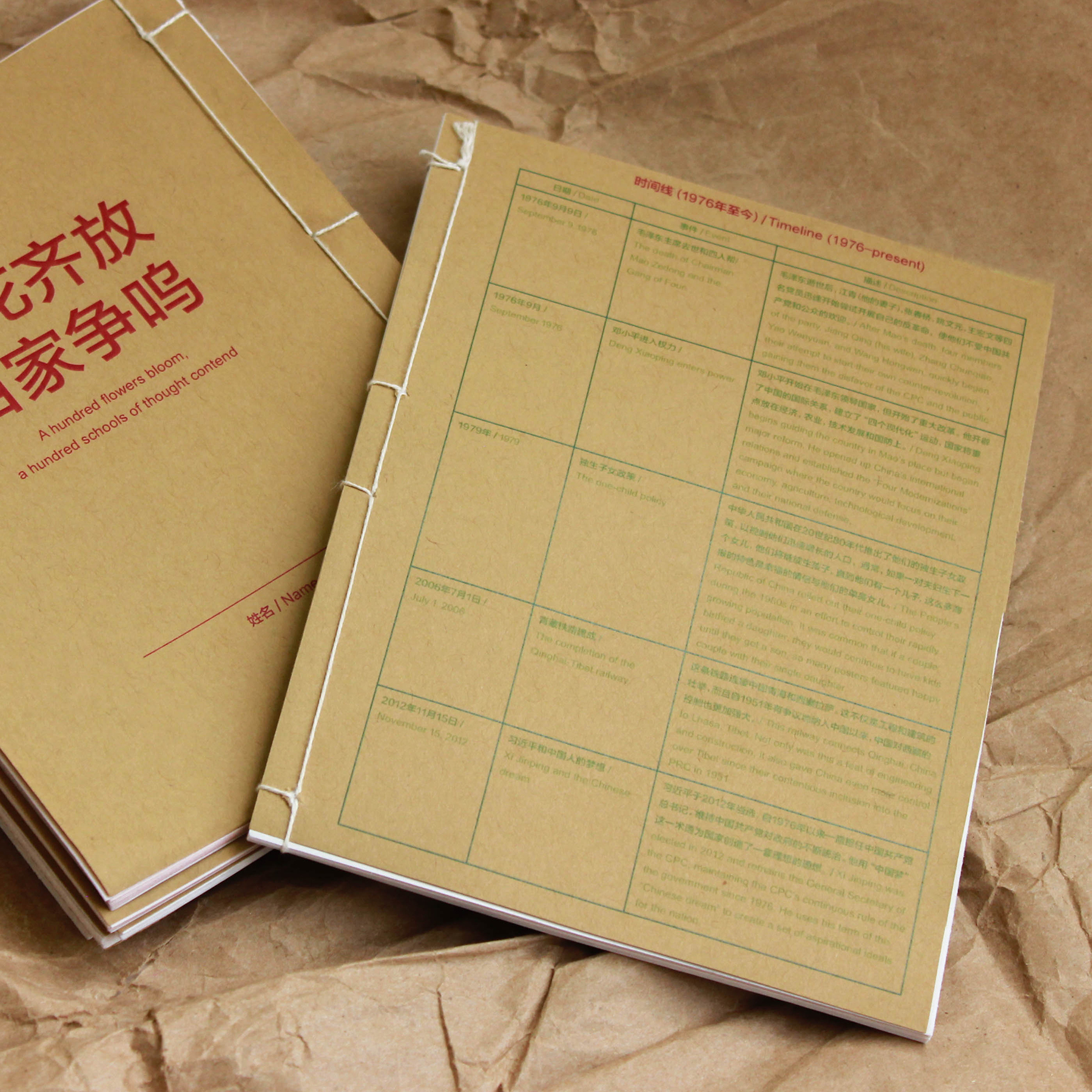
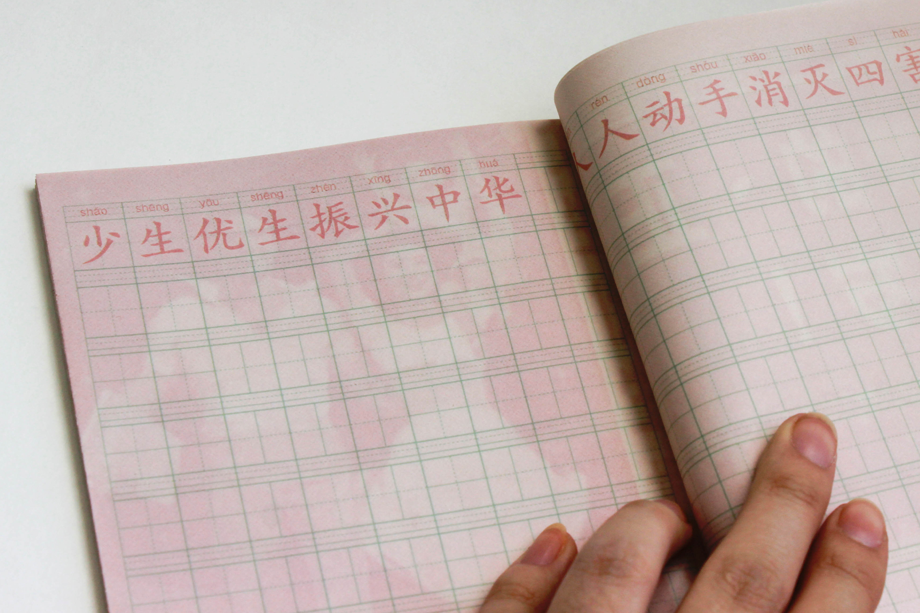
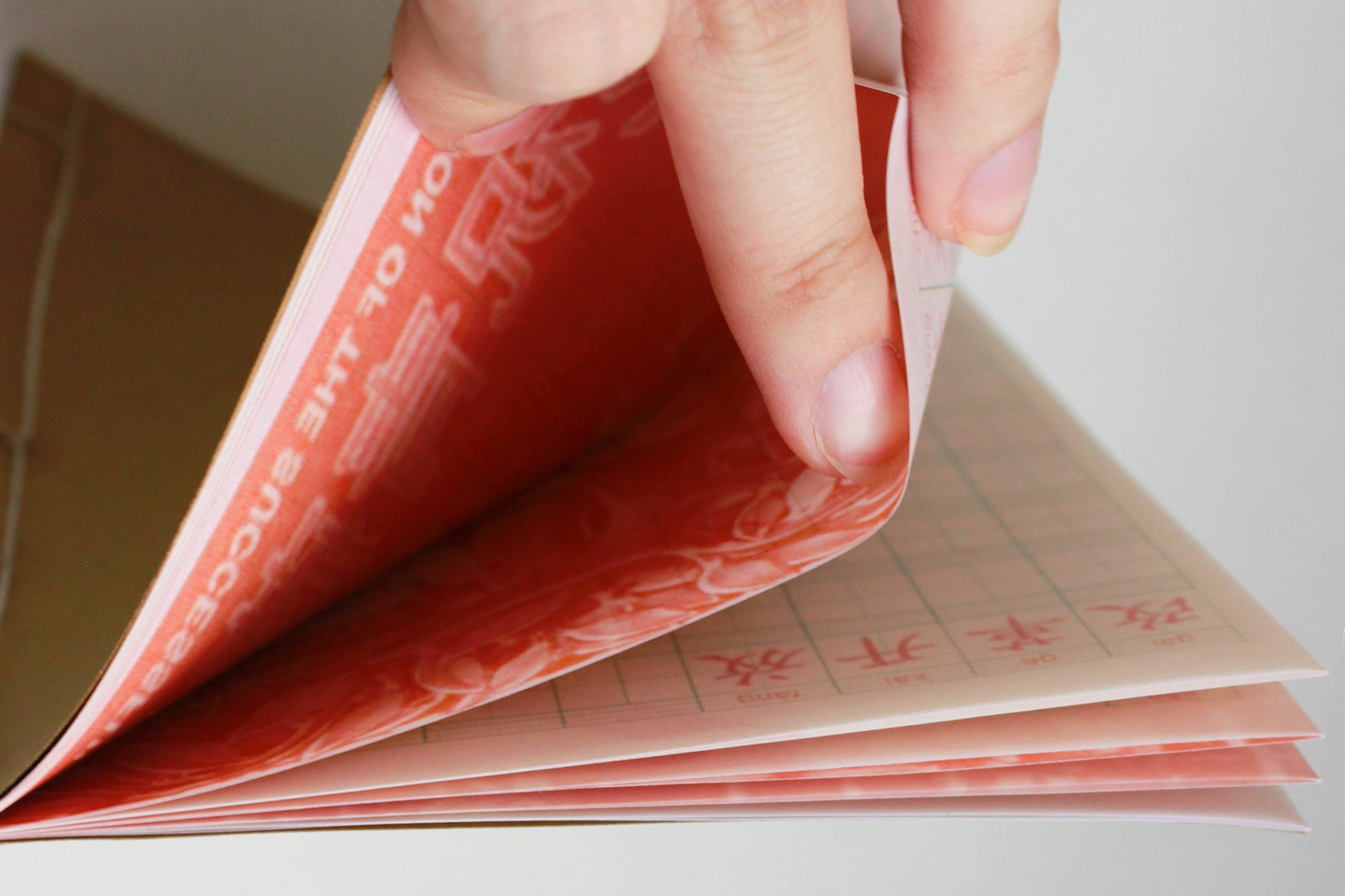
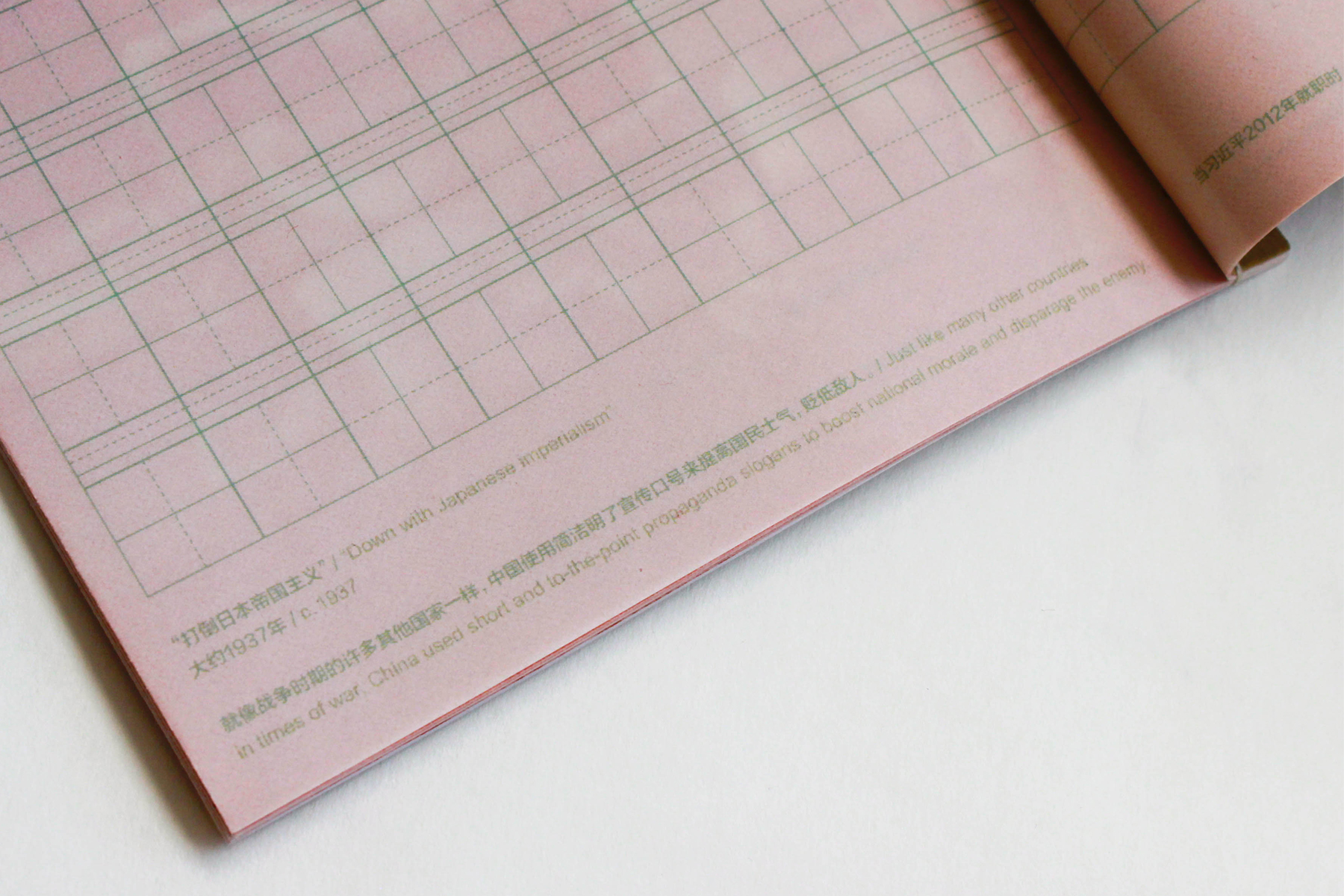
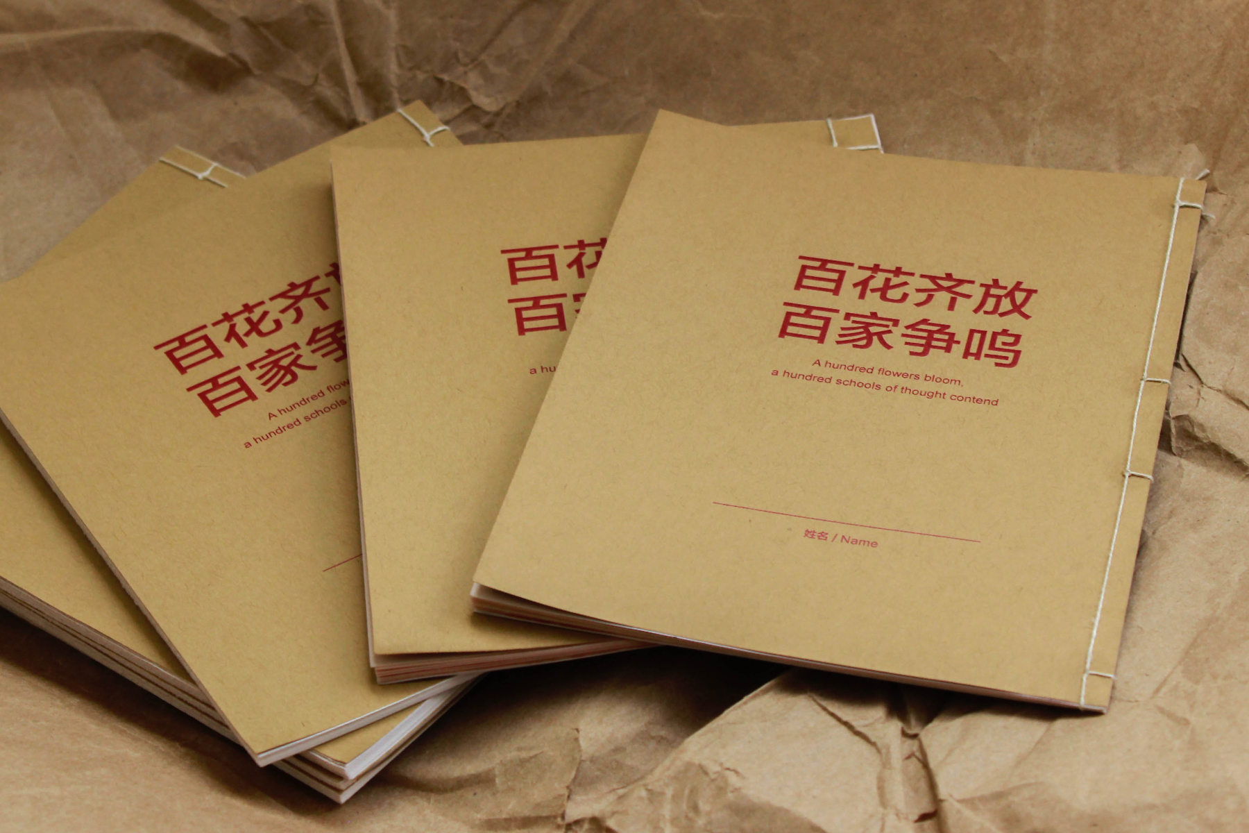
A Hundred Flowers Bloom, 2018
// Handbound 5 × 7 in handwriting practice books. Edition of 6.
This set of handwriting practice books is meant to be a teaching tool that helps to engage the user with both the language and history of China, but does so with a critical lens that acknowledges the wrong-doings and negative influence of the nation’s government. While at first the book comes off as a somewhat regular and mass-produced item, as you look closer, you can begin to uncover the true intent of its contents.

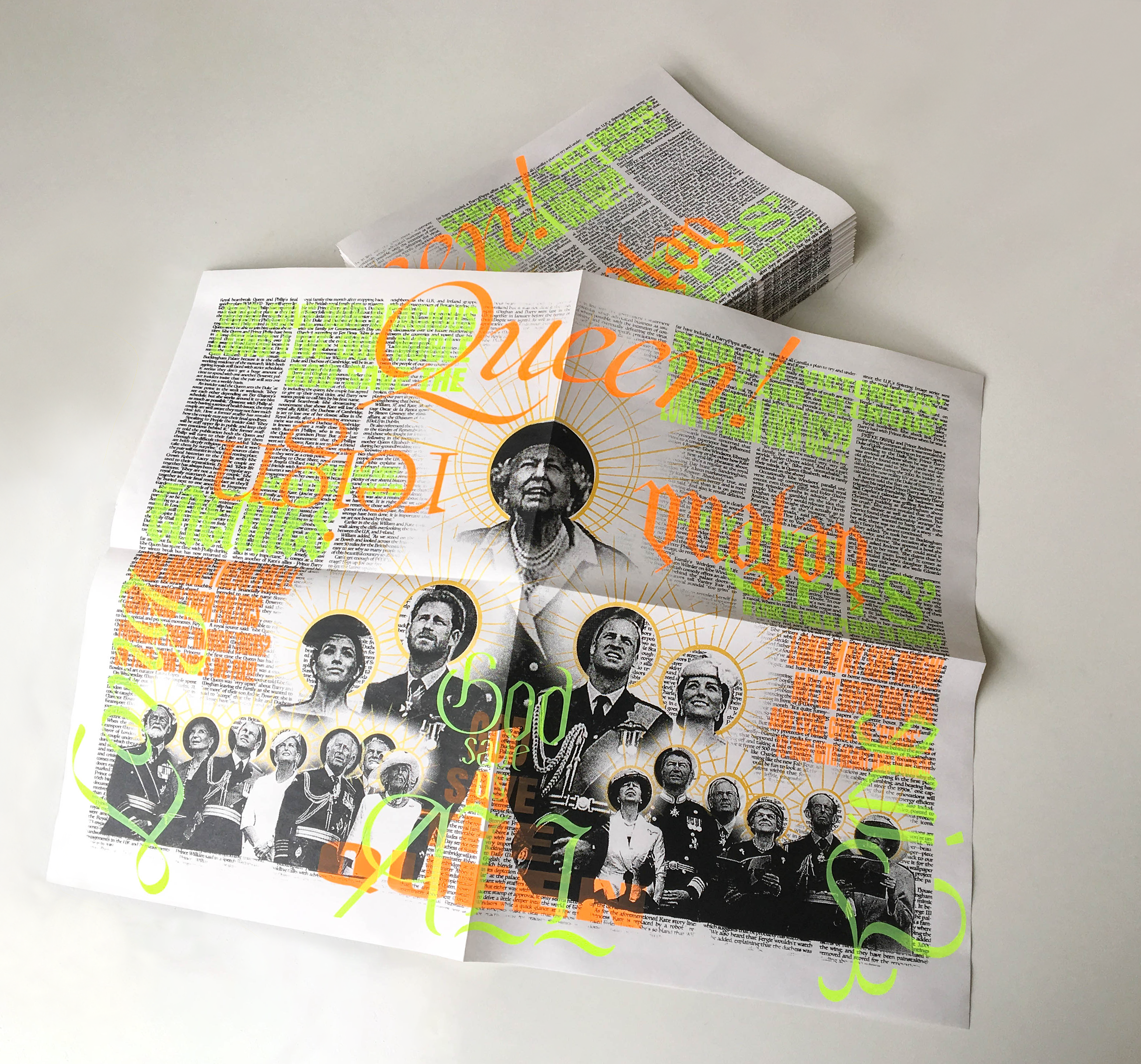
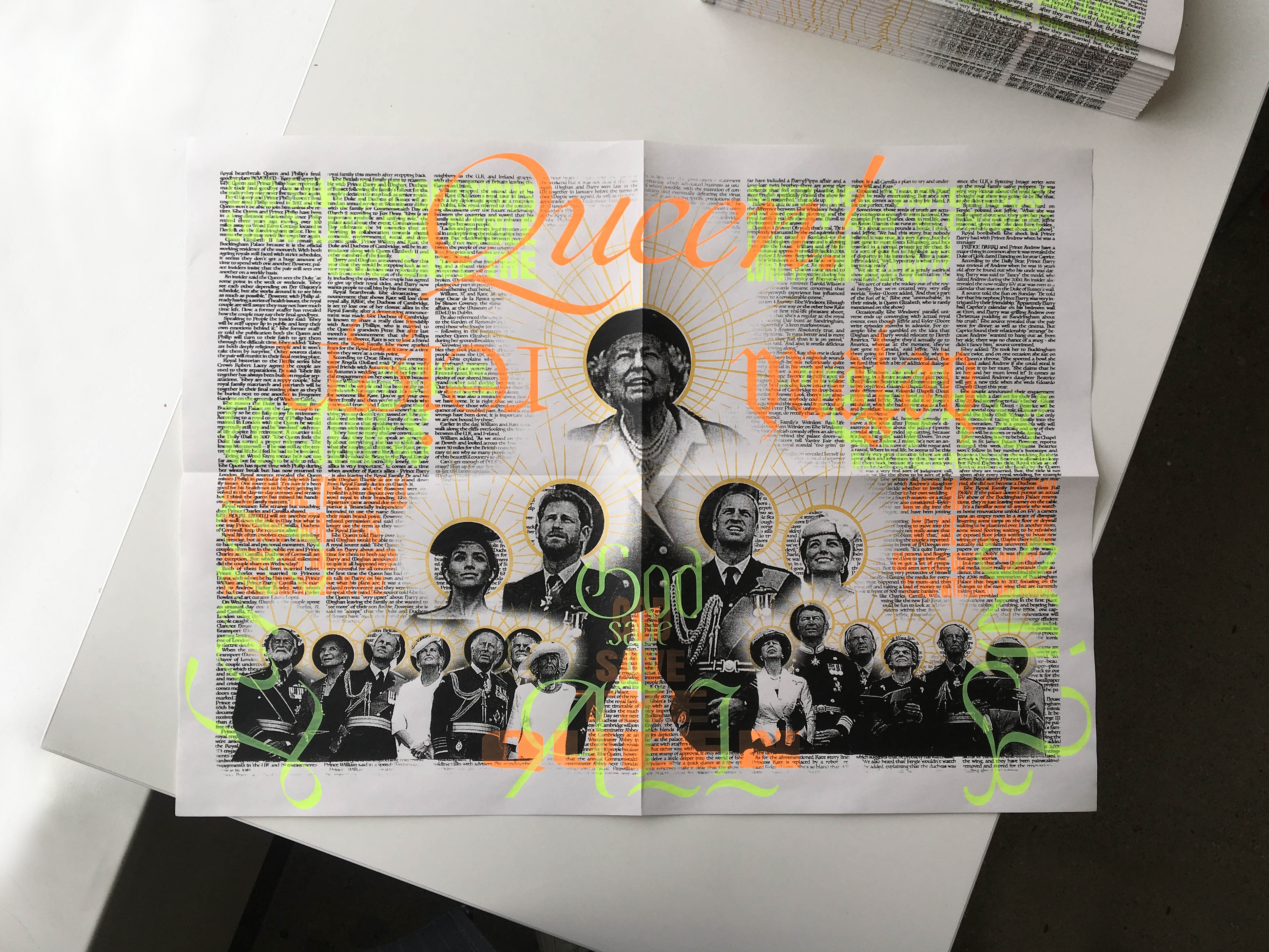
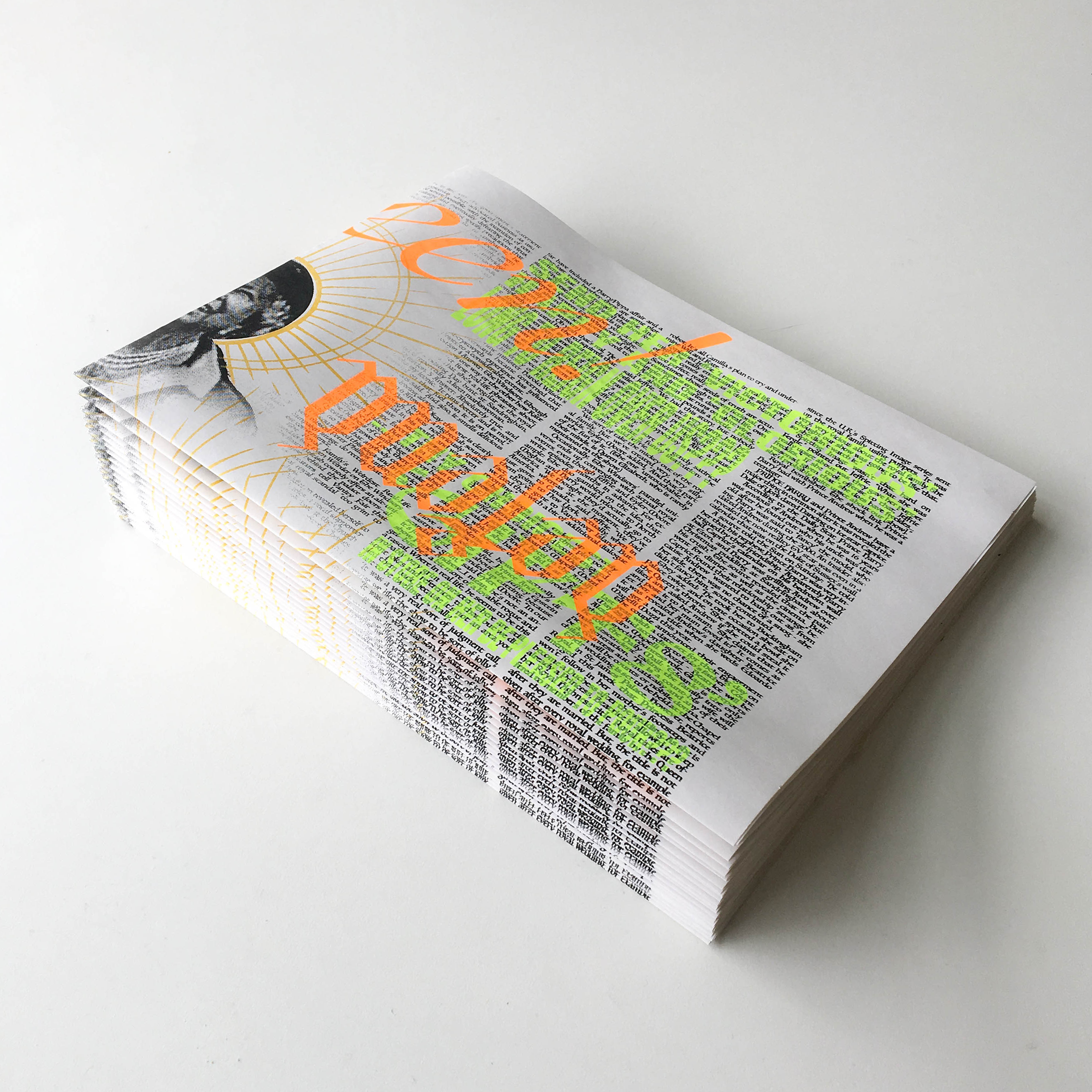
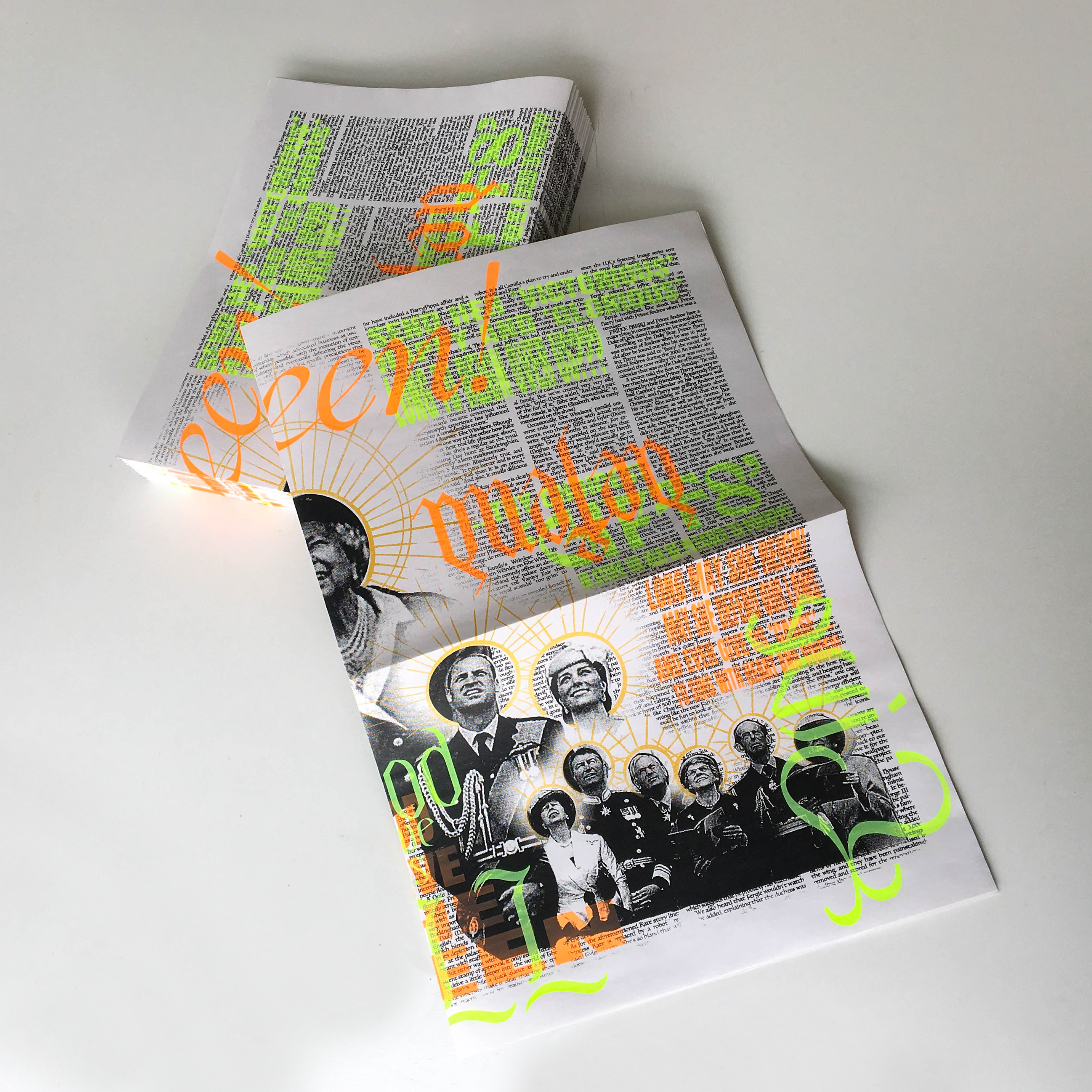
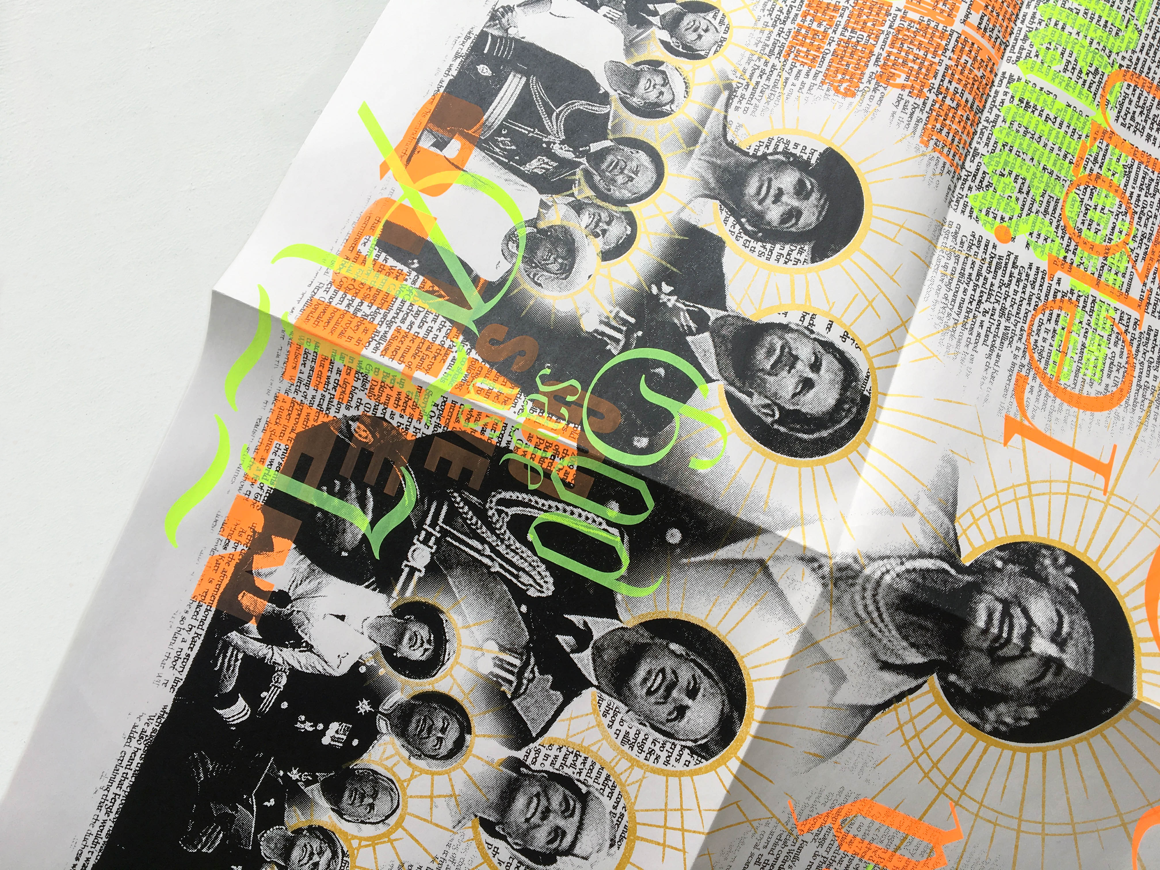
Save Us All!, 2020
// 24 × 18 in screen prints. Edition of 25.
Save Us All! is an edition of prints that satirizes The Royal Family’s perfectly planned and measured public image to highlight the gossip and tabloid news that keeps the family relevant and present in popular culture. While exaggerating the monarchy’s grandeur by transforming their balcony photo from the Trooping the Colour ceremony into the image of saints, these “holy” portraits are overlayed with loud and brash text—the background is composed of tabloid articles that gossip and speculate about the family’s lives and the foreground consists of the words from God Save the Queen stretched, scaled, and transformed into eye-catching headlines and titles. This work is a part of my undergraduate capstone project that addresses the issue of disinterring history and speaking about the pain of others.
Rave in Berlin 1100, 2019
// Web-based font.
Rave in Berlin 1100 is a display face created purely with HTML and CSS. While its rigid set of rules and alignments keep it in a strict blackletter-esque order, its pointed curves sweep above and below the cap-heights and baselines to form a systematically dramatic set of glyphs. This display face was used in my web-poster for Monday Night Seminars.
View the full website here.
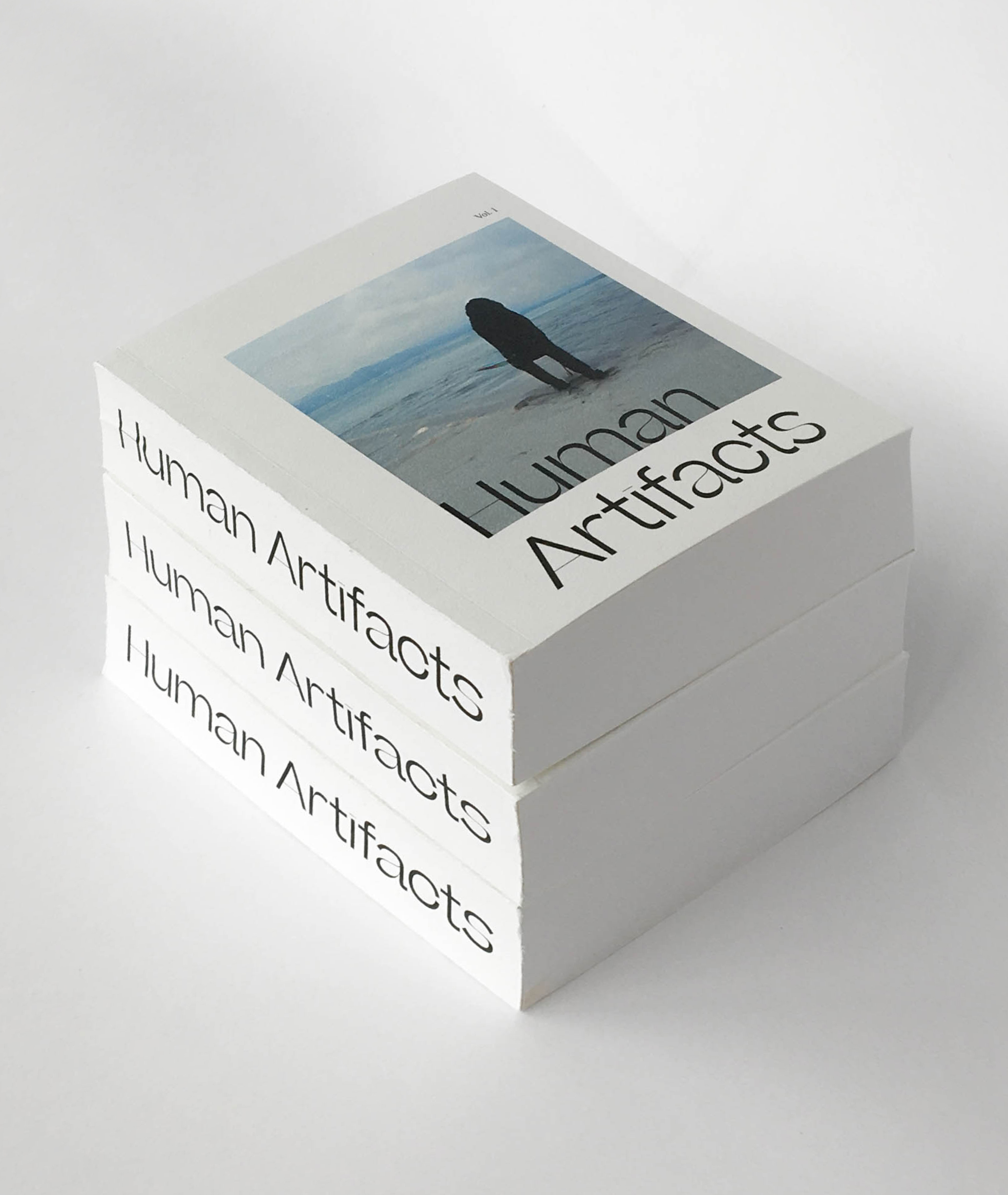
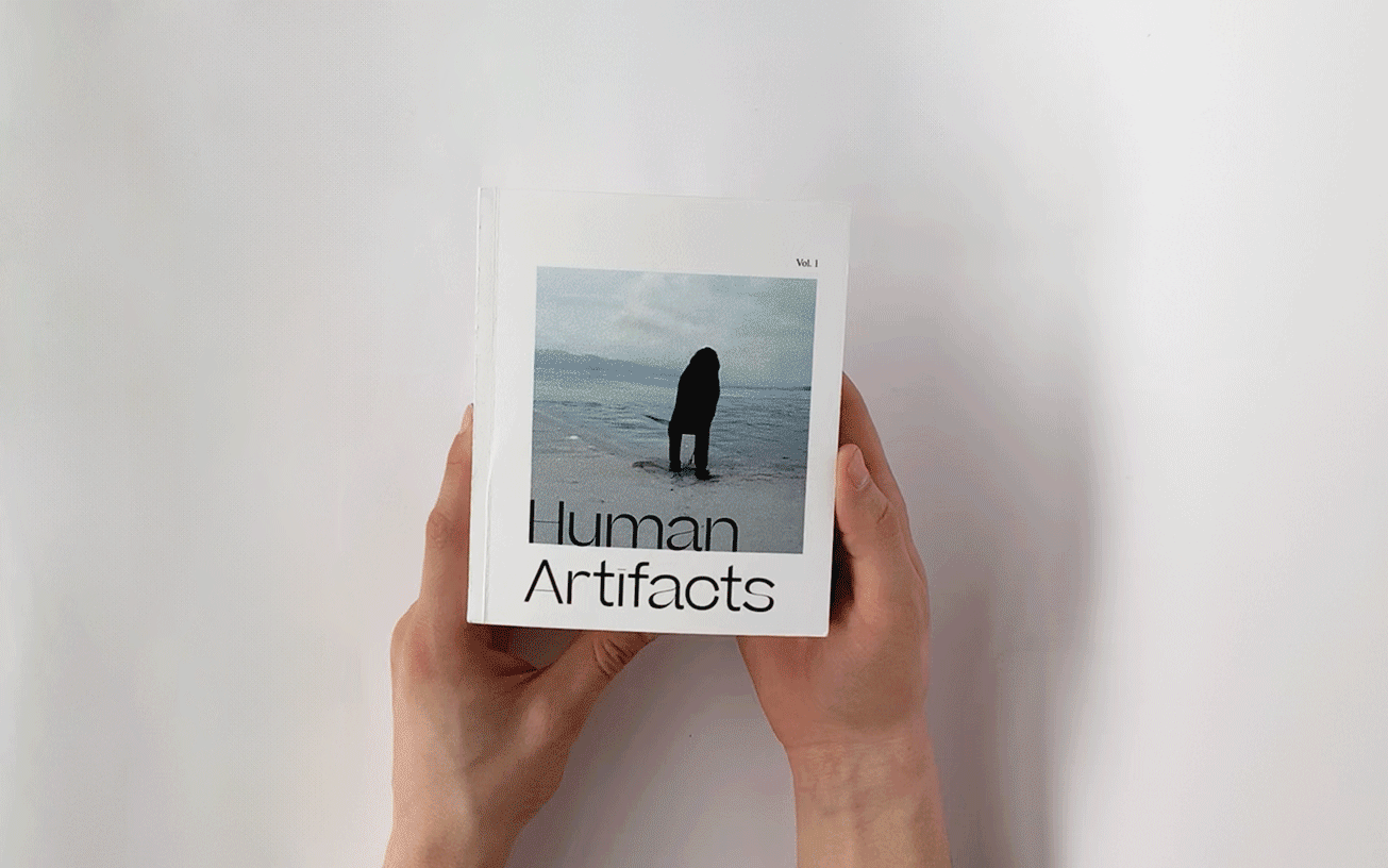
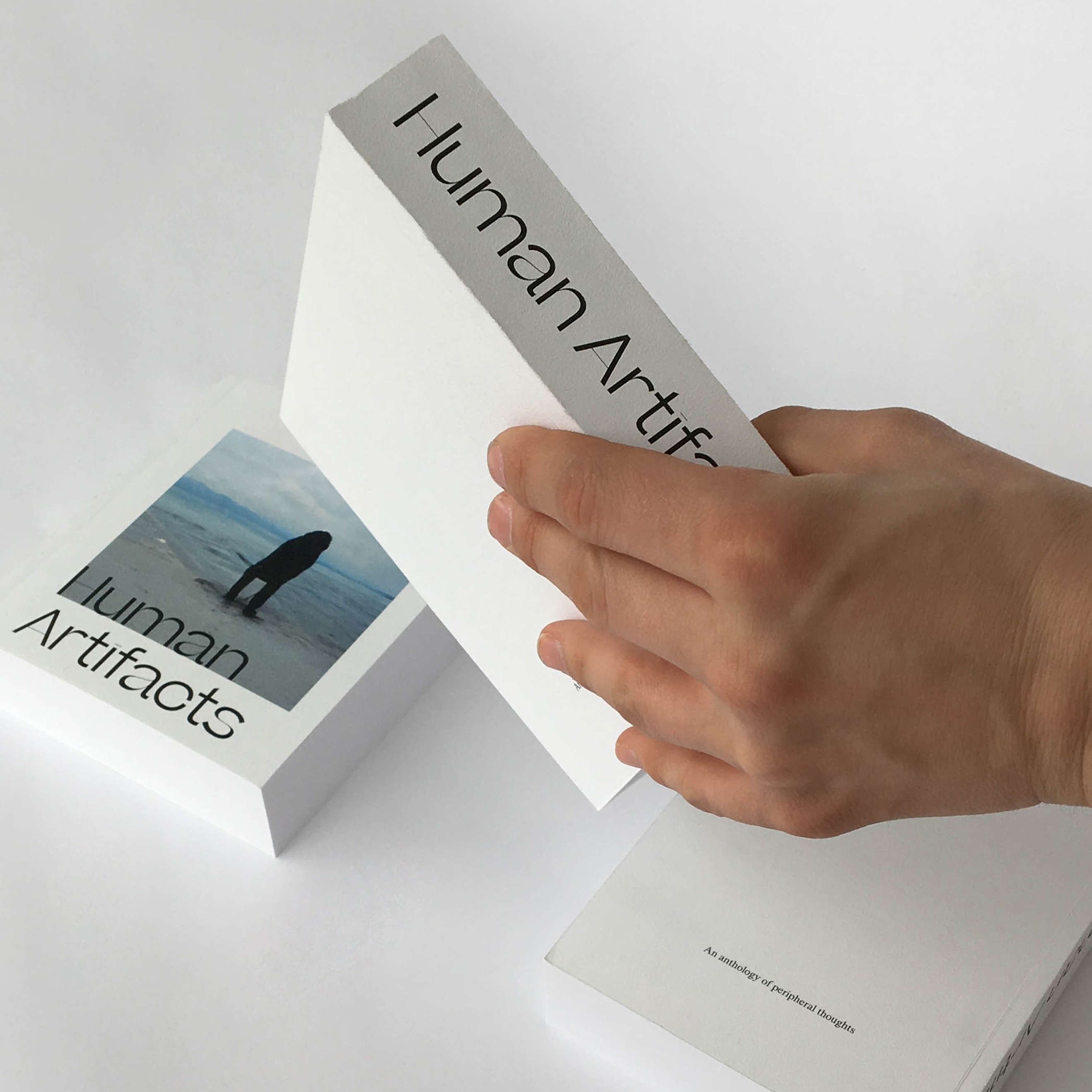
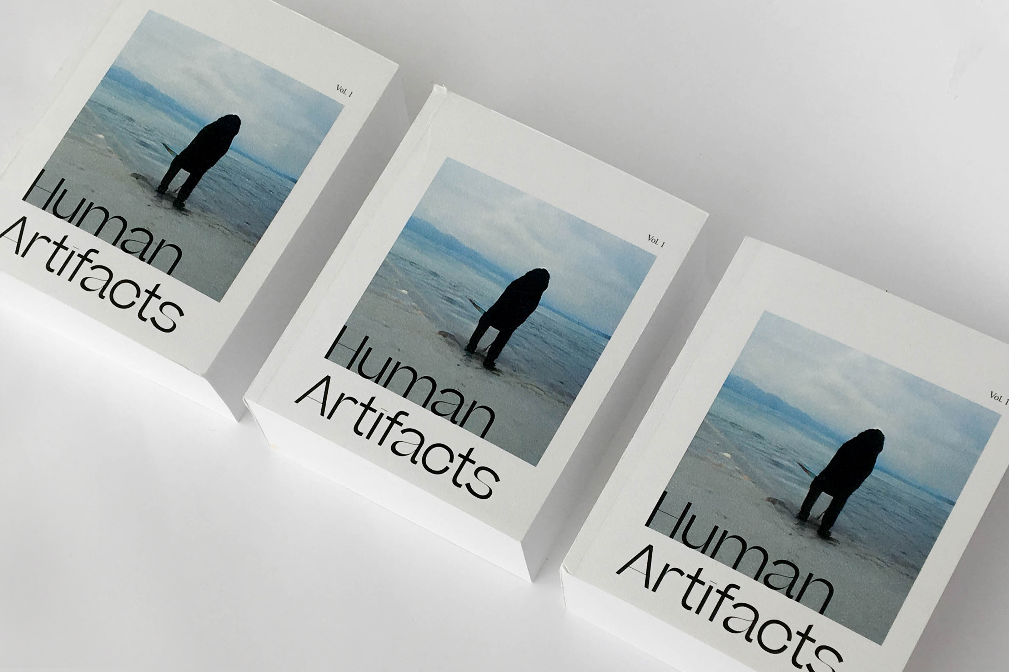
Human Artifacts, 2019
// Handbound 4 × 5 in books. Edition of 4.
Human Artifacts is an anthology of algorithmically-made stories that reveal the ways in which our digital culture can artificially reflect intimate emotional experiences. Trained from ImageNet’s non-human categories, images were bred together to create morphing sequences that somehow still capture human-like figures. Despite the categories not meant to portray humans, the few people that have snuck into other categories of objects and landscapes are able to creep their way in to the series of uncanny images. Although the algorithm that produced these photos are not meant to recognize a human figure, they are still able to tell a narrative. This work is a part of my undergraduate capstone project that addresses the issue of disinterring history and speaking about the pain of others.
Below is the afterword of the book:
None of these images were meant to include human figures. At the very least, they do not include any genes that might hint at their anthropormorphic origins. Barbershop, running shoe, tree frog, flamingo, Schipperke, fire engine are all things that these images proclaim themselves to be. But, there’s something more to this, isn’t there? There must be, or how else am I able to see a child grow up or watch two lovers drift apart?
Of course, such a feat is unachievable without some level of human intervention that shapes and manipulates these uncanny forms into something that feels a bit more familiar. These images were selected, sequenced, and titled by myself, but their actual creation was dictated by something beyond our shared understanding of image-making. In other words, each image was made using machine-learning algorithms that bred one shadowy frame with another to form each of these almost-humans.
Does it surprise you to know that the neural network that produced these portraits does not even know what a human is? These networks do not learn in the same way we learn. While they were modelled after the human brain, in reality these algorithms were made to read and identify pixels and make relationships between them without the need to understand what meaning was held within these 512 × 512 grids. Images, along with their assigned tags and labels, were fed to them by people—people with their own complex lives, partialities, and preferences. A machine-learning algorithm can only learn and produce from what its been given. Yet, 81.1% tub, 12.3% angora, 3.5% monastery, and 3.1% lumbermill produces something so powerful and tactile that you end up forgetting about all of that.
This isn’t to say that the making of these images are immune to human influence. Rather, it is this bias in its very nature that has subconsciously guided the selection of training images to allow scatterings of people to appear in the backgrounds or sidelines of the targetted subjects. It is these peripheral figures that reemerge into the ghostly entities that fill these pages.
The making of Human Artifacts was possible thanks to Joel Simon’s Artbreeder project.
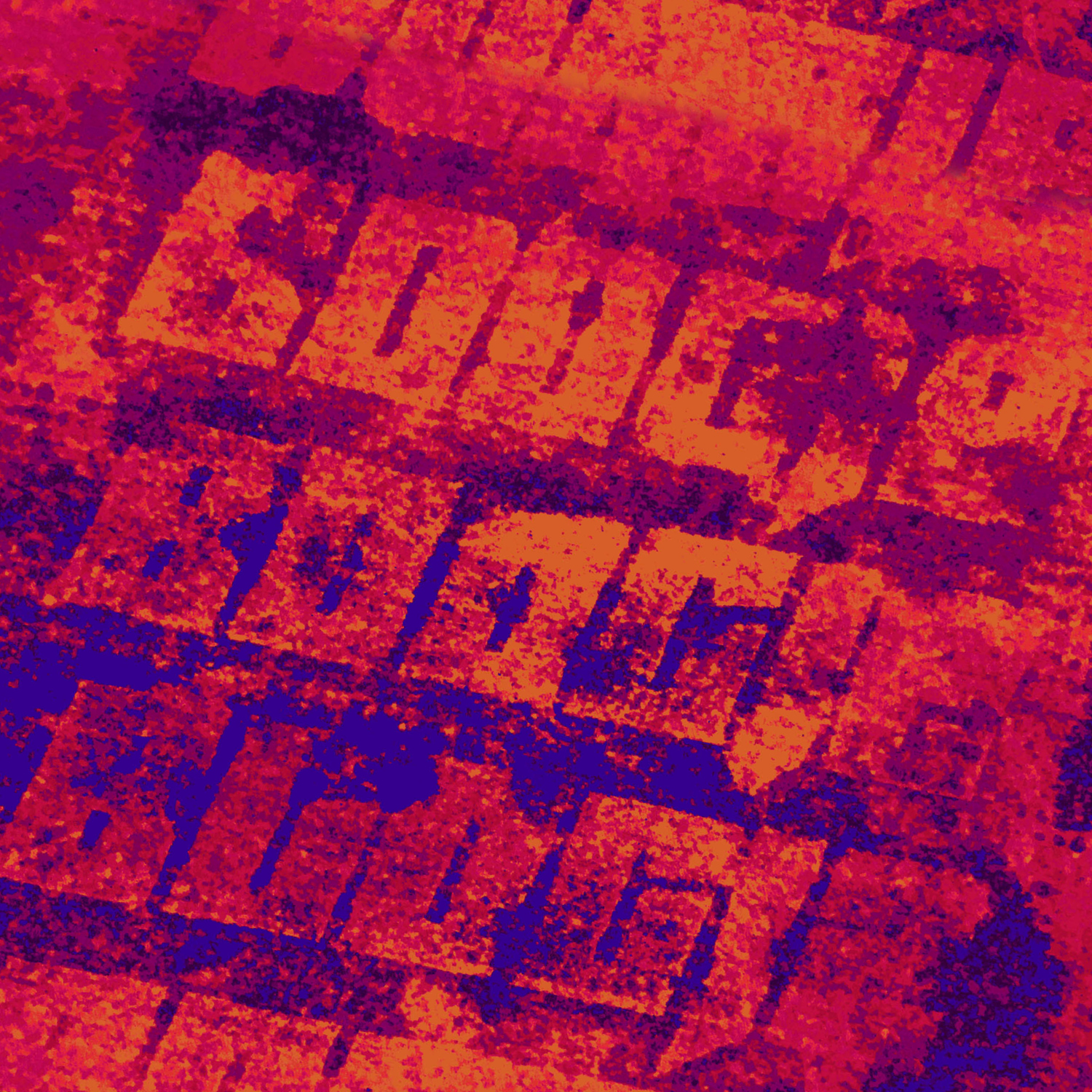
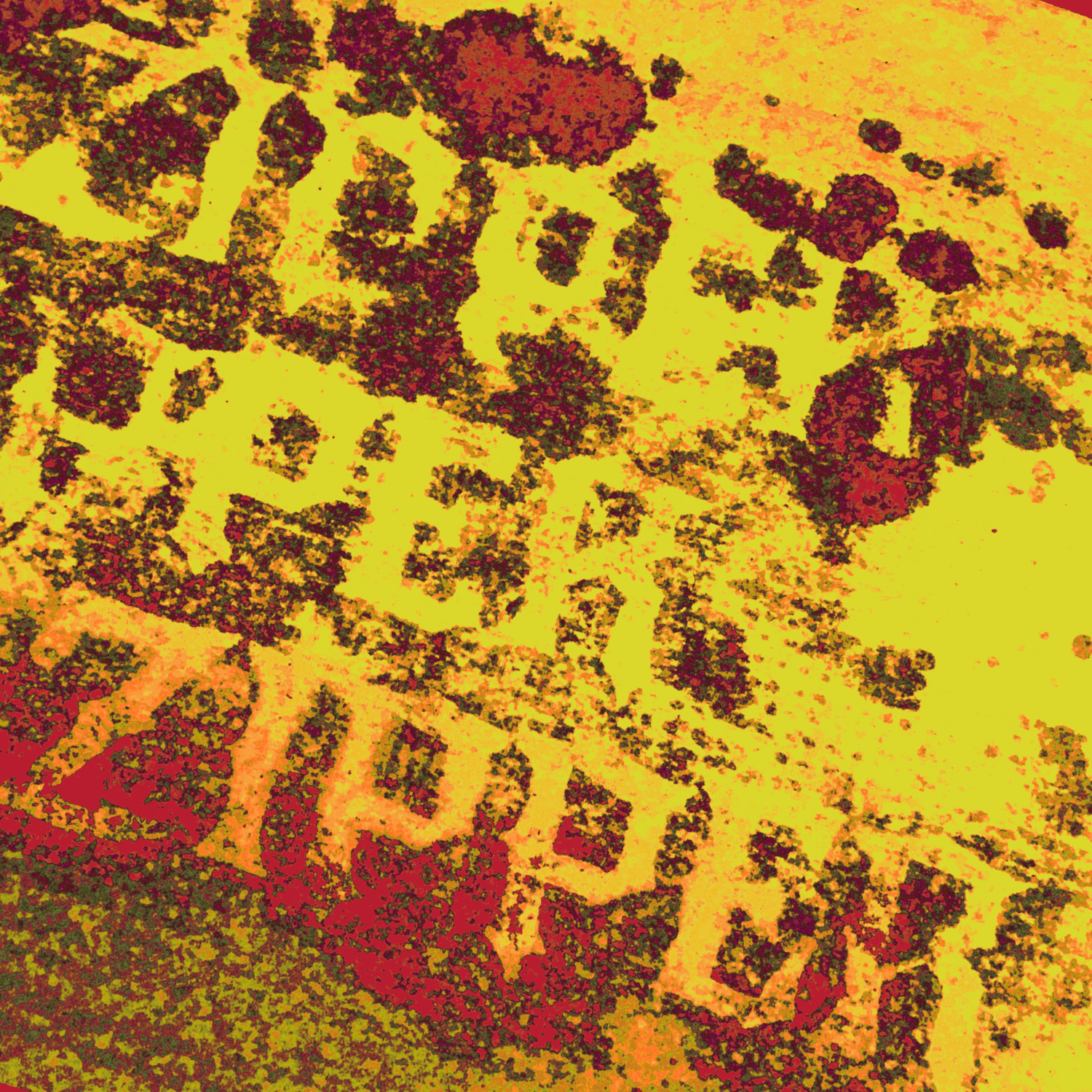
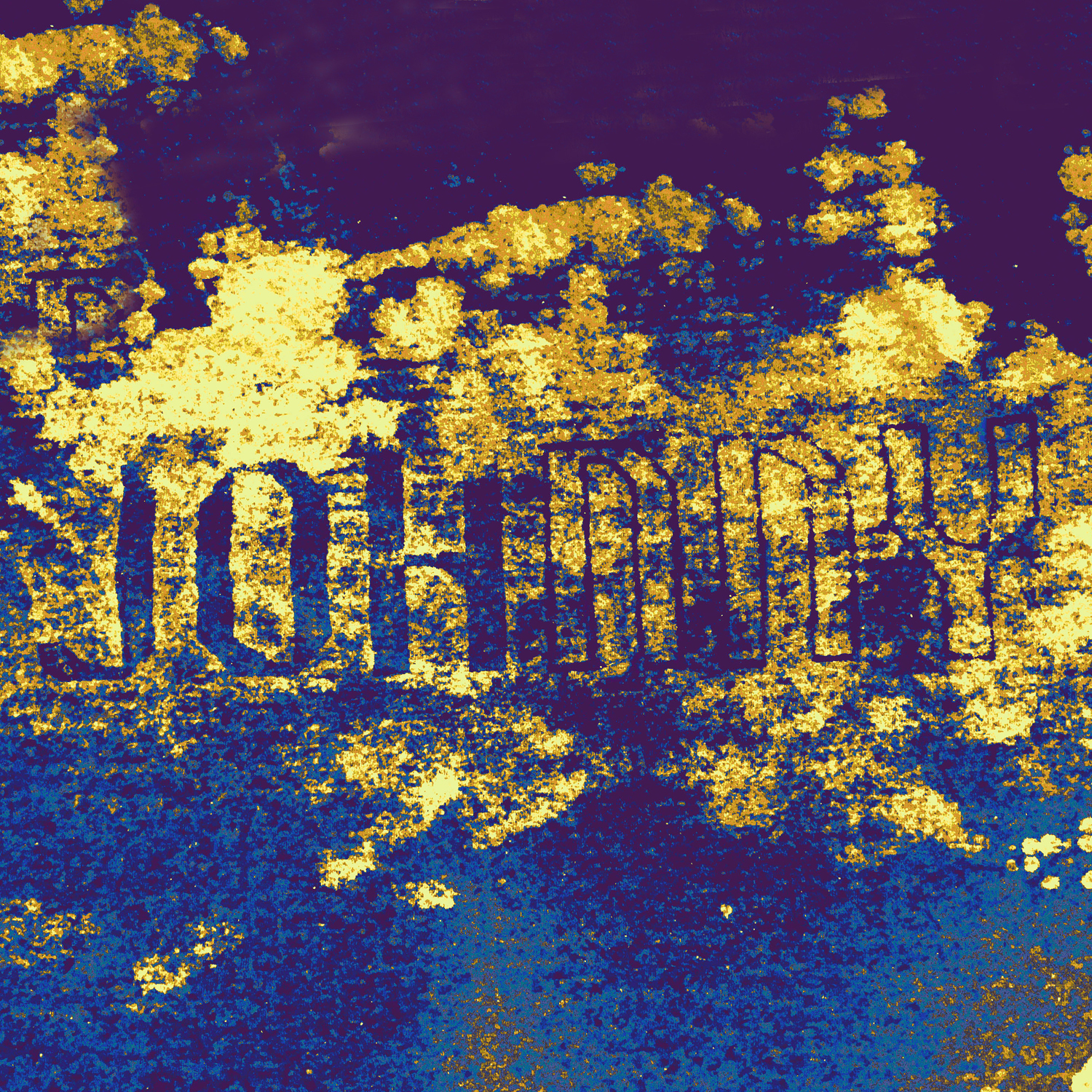
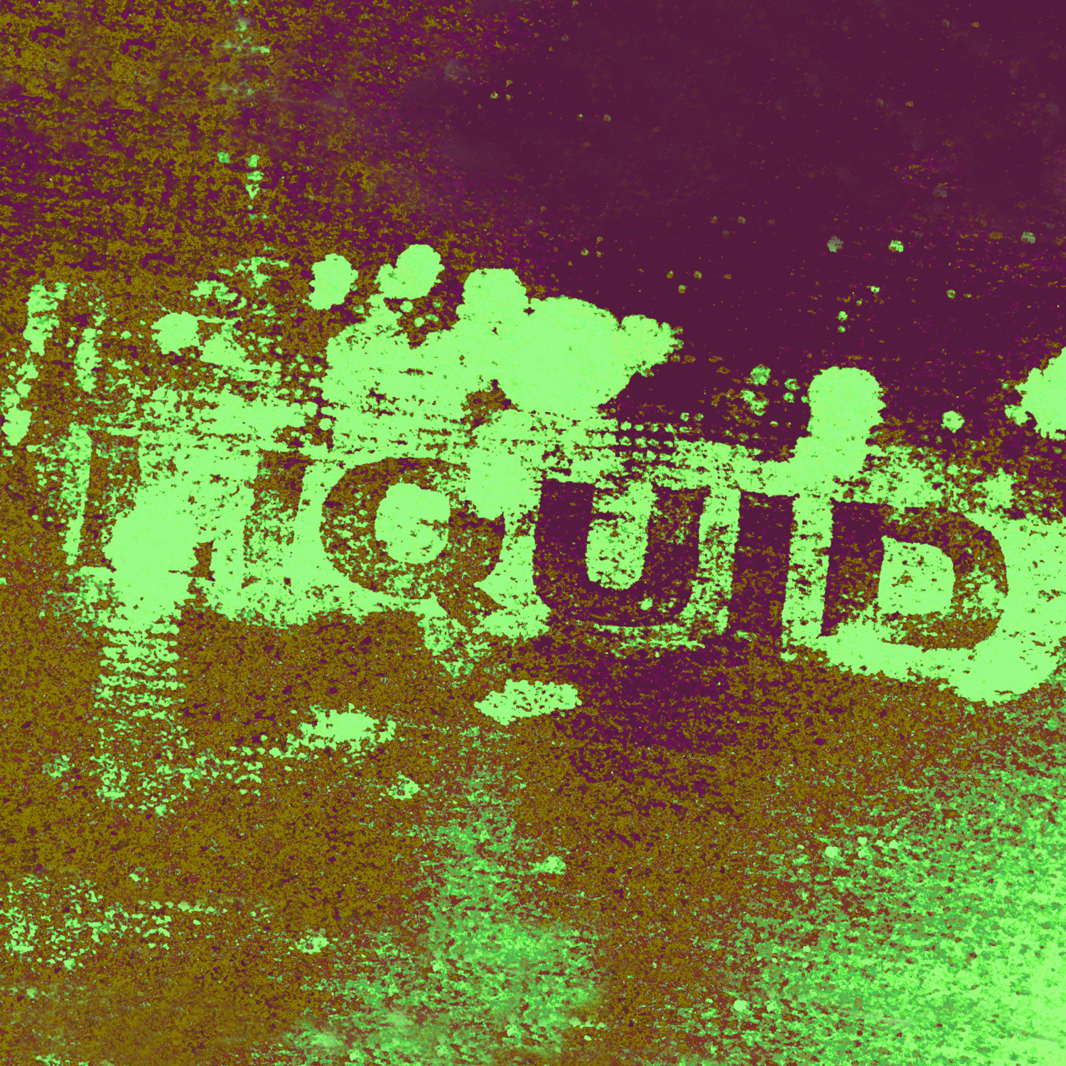
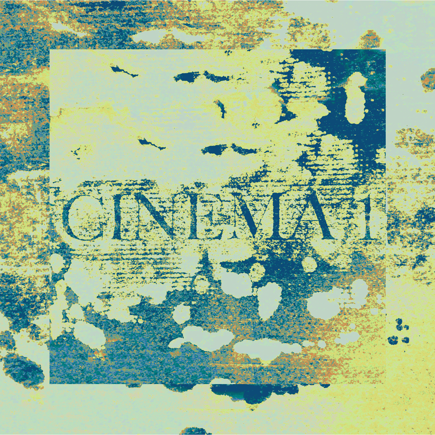
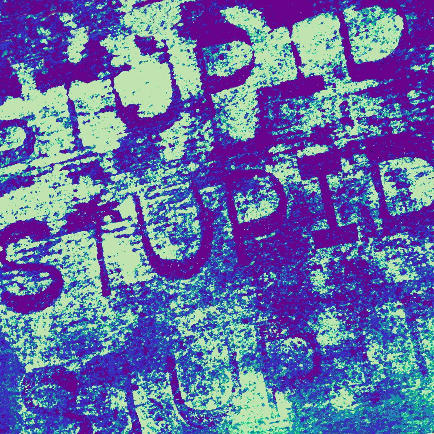
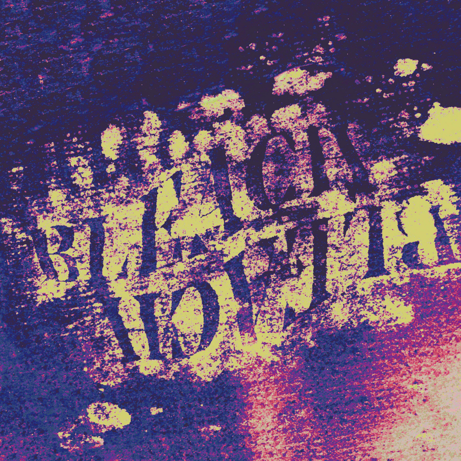
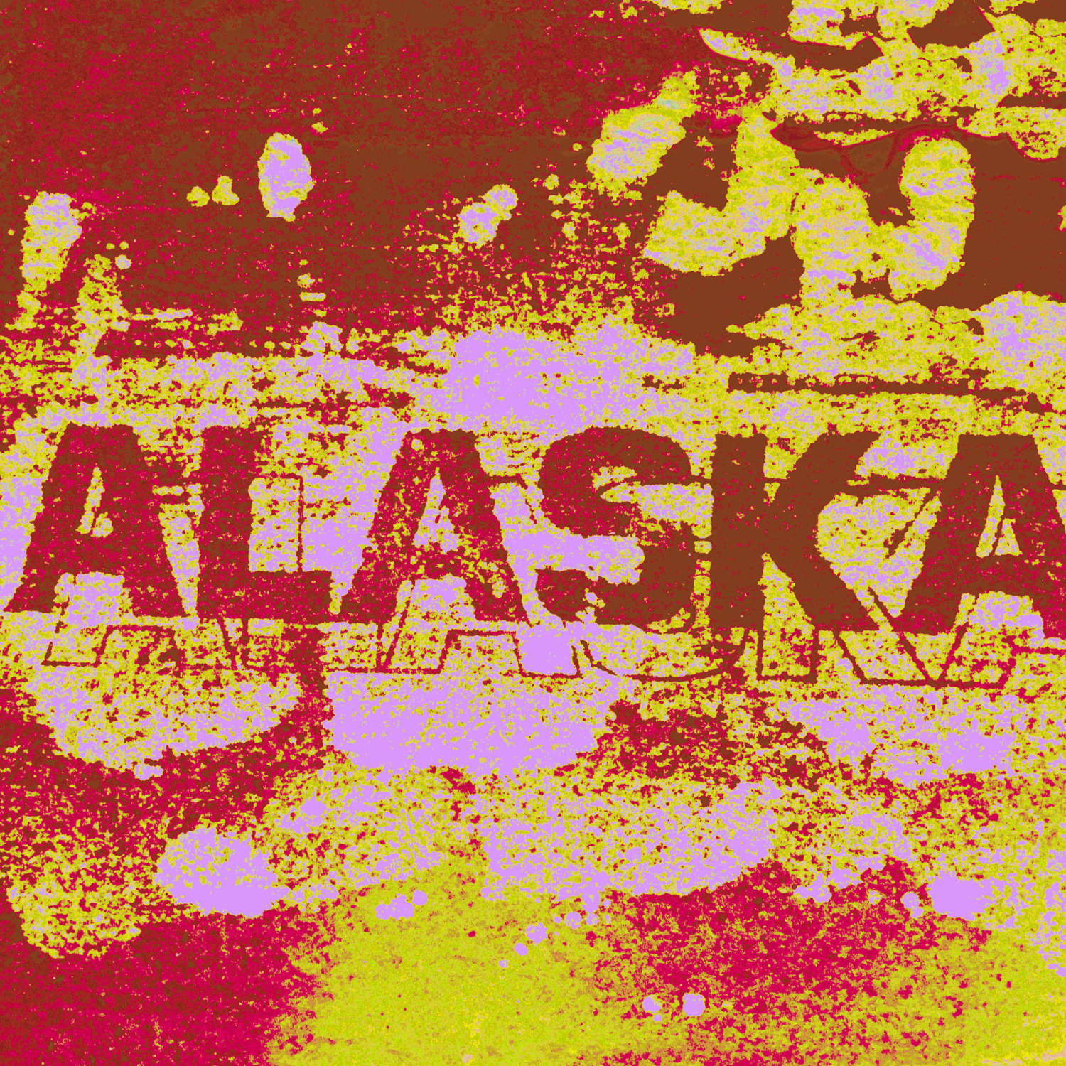
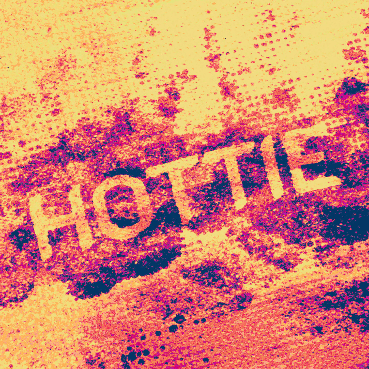
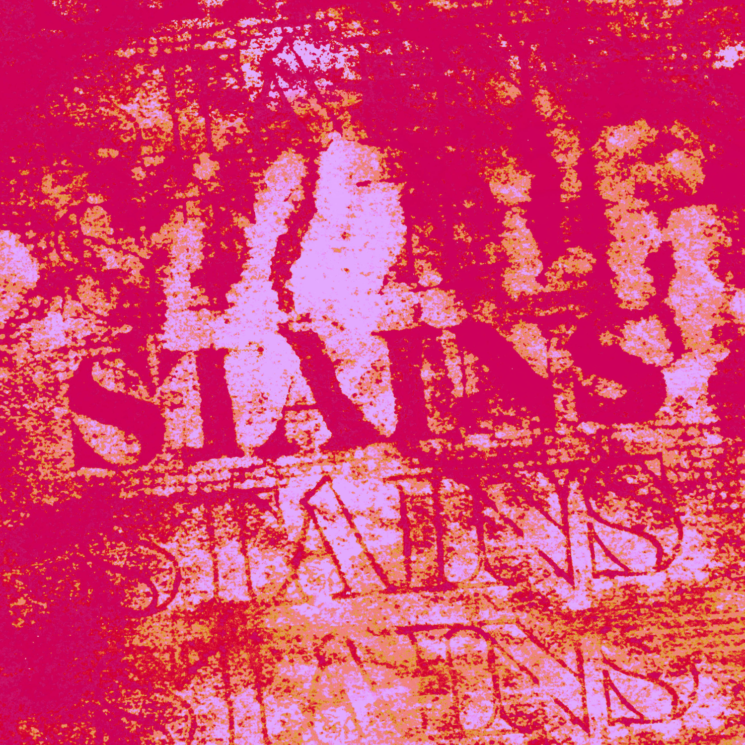
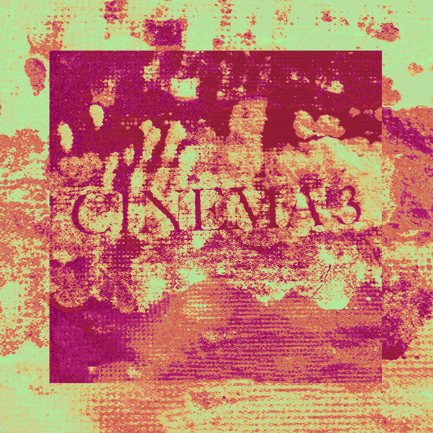
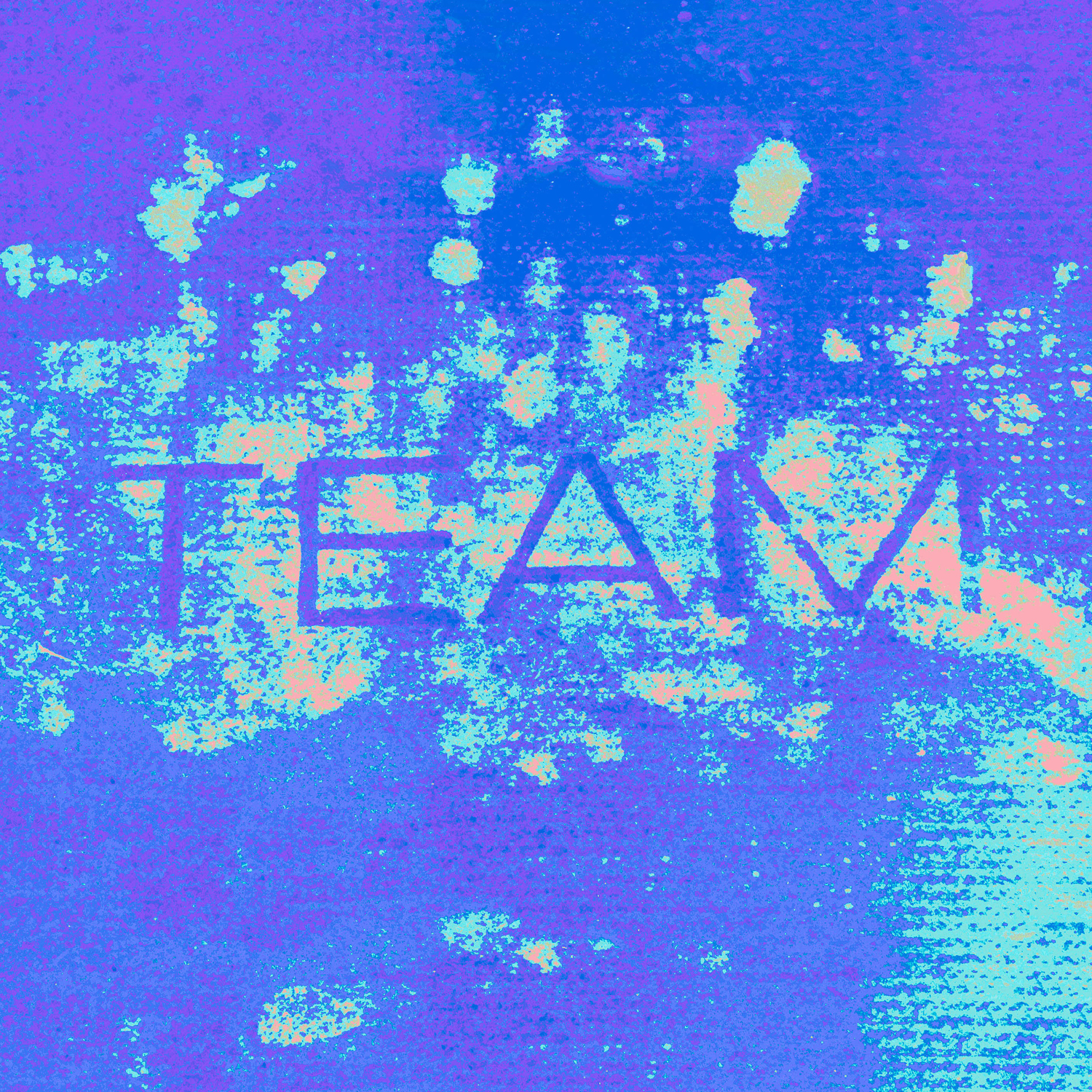
SATURATION III, 2019
// Hypothetical series of 15 digital album tiles for BROCKHAMPTON’s album SATURATION III
Made as a hypothetical mini project, these album tiles came from impermanent printing experiments. The type was designed digitally and printed onto paper with a laser printer, dampened with water, and then textured paper towels were pressed into the wet paper by hand. Due to the ink’s resistance to moisture, a water impression is left on the paper towels as a sort of temporary ink, which was then photographed. The photos were then digitally altered into different colours and gradients. This process captures all the imperfect splatters, fingerprints, and bleeding edges from all the translations between mediums.
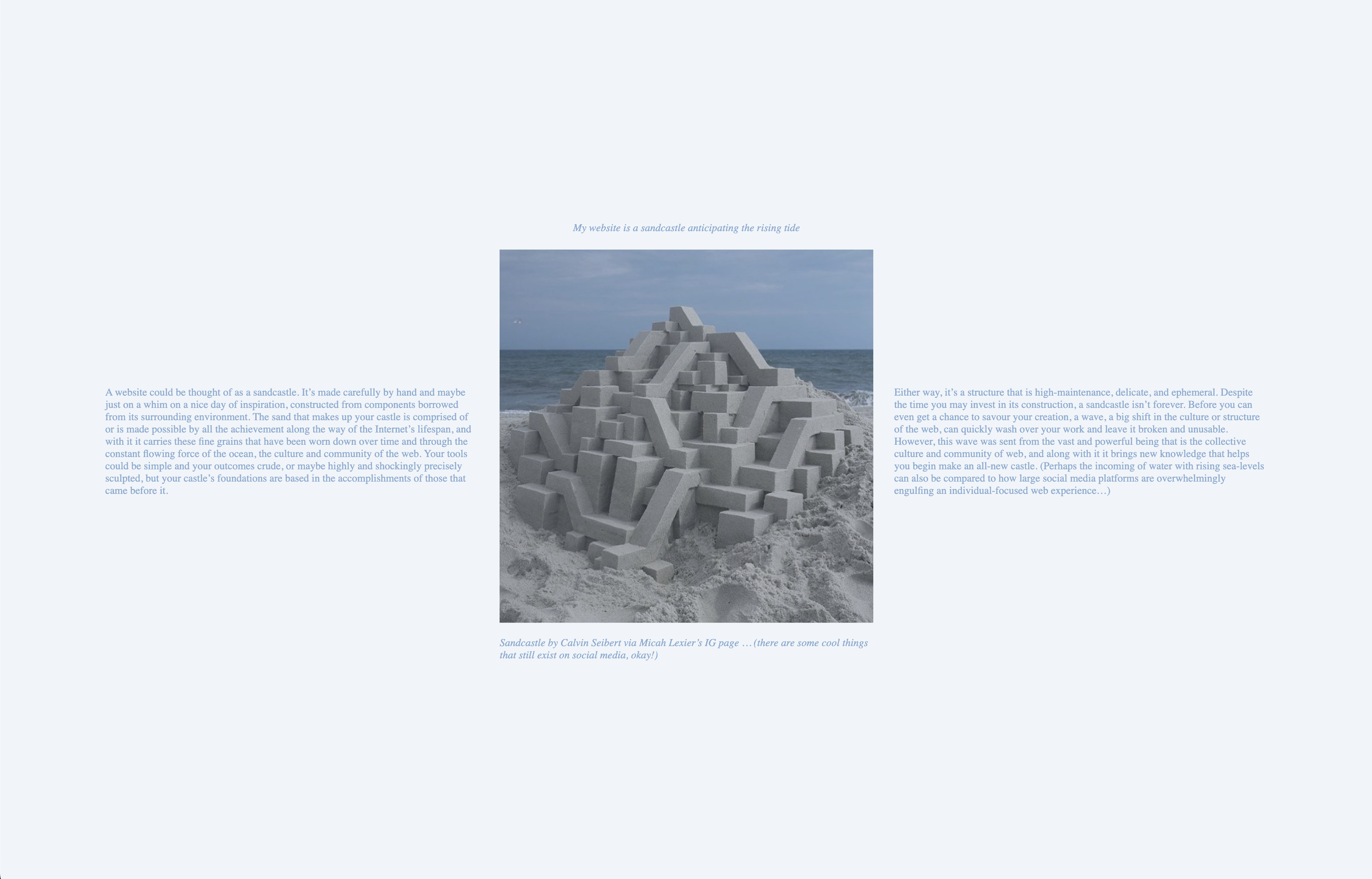
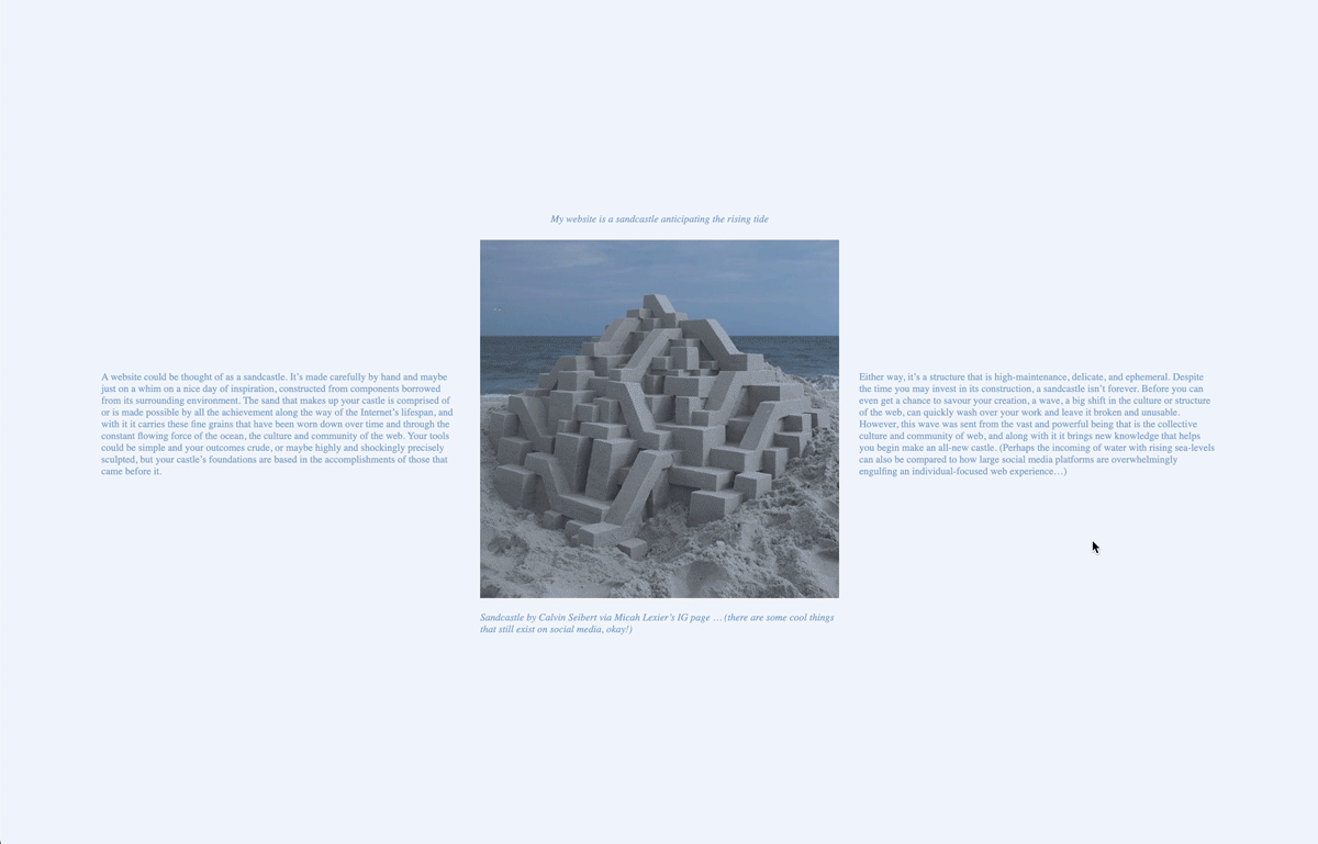
My website is a sandcastle anticipating the rising tide, 2019
// Single-page website.
This one-page site was is an interactive representation of the impermanence of the web and how sites can require constant maintenance to avoid becoming completely unusable or defunct. Sometimes obsolescence can be inevitable, just as the tide rises along the seashore.
As you spend more time on the site without moving or clicking your mouse, the screen slowly starts to fill with blue until the entire page is drowned in water.
View the full website here.
The Death of Stalin, 2018
// Handbound 4.5 × 6 in book and 8 × 10 in magazine.
The screenplay of The Death of Stalin formatted into two different types of propaganda: a little red book and a tabloid magazine.
// The book includes the full length of the screenplay while the magazine highlights key scenes through layouts that mirror the visual composition or energy of the dialogue.

